13 variants of the emblem "Army of Russia" from the Ministry of Defense, or Artistic Climax

384
The main military department of the country is preparing a truly epochal innovation. Why epochal? Because it concerns the new symbols of the Russian army, namely, those signs and symbols that the world will see on the form of Russian military personnel, on the wings and sides of Russian military equipment. The idea of ​​creating new symbols for a new army seems to be based on quite the right things: a new army, which means that the distinctive signs can be changed according to the new status. But only the ways to solve this serious issue by the Ministry of Defense, to put it mildly, are surprising. However, first things first.

13 variants of the emblem "Army of Russia" from the Ministry of Defense, or Artistic Climax


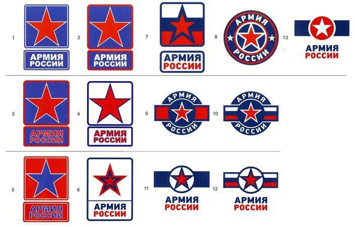
Last week, a meeting of the Public Council at the Ministry of Defense was held in the hall of the Cultural Center of the RF Armed Forces. Sergei Shoigu at a large table gathered scientists, culture, art; there were famous singers, war correspondents, former athletes, politicians and high-ranking military personnel. The main part of the meeting was devoted to attracting contract servicemen to the army, new military uniforms, measures to popularize military service, the need to increase the number of youth military-patriotic clubs in the country. However, as it turned out, the Minister of Defense is the main thing in store for the final stage of the meeting. 13 samples of the new symbols of the Russian army were presented to those gathered, each of whom had to choose the ones that seemed to him the most suitable. Before distributing printouts, artists, musicians and others anticipated the graphic extravaganza and the abundance of dissimilar emblems that corresponded to certain military traditions. But what they saw led the majority of those gathered in a real stupor.

A piece of paper appeared in front of them, on which something was depicted ... Moreover, it was announced to everyone that one option would win out of the "something" presented, and you need to choose and approve it before the beginning of October ... No, well, about the shock deadlines for making decisions knew. Our country is traditionally glorious for this ... By the next anniversary of the Komsomol, to the anniversaries of the revolution, it was a business, they built, handed, handed over, accepted ... And now they try to hand over something timidly, but only military symbols these are not like Olympic facilities, not a cosmodrome, not new houses and apartments, which need more than urgent provision to flood victims in the Amur region ... Why such a hurry? Why exactly before the beginning of October, and not at all until the end of this week? .. What kind of monumental holiday is going to celebrate the Ministry of Defense in October, which does not allow us to devote more time to the proposal and discussion of new military symbols. Isn't it the seventh of October that everyone cares so much? ..

So back to the proposed ministerial "specialists in graphics" options for the emblems of the Russian army. Readers have already managed to look at these "spotlights" and, probably, appreciated them at their true worth ... If it seemed to someone that all these symbols were derivatives of one, and one directly connected with some other army (with which, most readers also guessed ...), then you are not alone with your suspicions. A well-known singer Sergei Mazaev, who was present at the meeting of the Public Council, also noticed that the emblems with stars in circles resemble American ones, which Sergey Shoigu reported. At the same time, Mazaev offered the services of a familiar artist who, in his words, can draw a quote: “a good emblem”. It was a clear unveiled hint that all the presented emblems can be classified as a sort of guano ...

Sergey Shoigu responded to the proposal of the singer in a peculiar way. The head of the military department said that the Ministry of Defense will consider a quote, “one more thing,” but only if this artist draws it quickly. This is where it came up: until the end of September - the beginning of October ... Like, where are they, if there are already thirteen of them! By the way, what a wonderful number for such a significant undertaking is thirteen ...

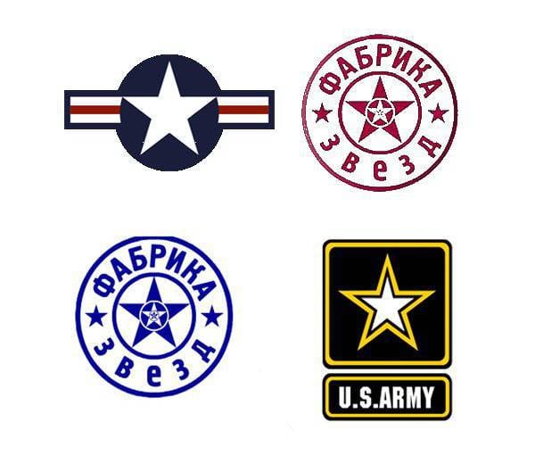
If even a quick run through the emblems that the unknown depicted (thank God, for himself, that his name remained unknown) is an artist, certain analogies emerge. Well, the stars in the circles - this is an indisputable copy-paste from the American "partners" from the Air Force. And the emblem numbered 8 is what? Army "Star Factory", or what? .. And the first seven options - this is a simple copy of the logo "US Army". And the red star is still “something” and “somehow”, but the blue-and-blue star is what it is all about? .. It is also surprising that the unknown maestro didn’t portray the star against the rainbow flag as an option ...

By the way, this is a selection of graphical analogies that should be demonstrated to the main military department, that maybe you don’t need to hurry with such an important issue, which, maybe, you should still entrust this work to people who are really able to create high-quality The final "product" for which will not be ashamed. After all, the emblem is selected for the Russian army, and not for some shop of amateur plagiarists ...

384 comments
Information
Dear reader, to leave comments on the publication, you must sign in.
  1. kazssr
    +1
    25 September 2013 20: 13
    GUYS, IS IT WORTH MAKING A BICYCLE, AND THE WORSE THING IS WHAT IS??? WHAT IS SHOWN LOOKS LIKE YUSEI ARMY AND SOMETHING ELSE BUT I CAN’T REMEMBER)) IF ANYONE IS FOR THIS LET’S LOCK THE MO SITE? I WENT ALREADY. hi soldier
  2. Tambov we ...
    +1
    25 September 2013 21: 08
    Here, it’s not even a menopause, but really, another cunning sabotage by overseas figures - it doesn’t work by force, let’s take it by cunning. Those. Let's try to change the established visual code. Wow, they are also strong in informational influence. And we fools, let's draw! And most importantly, do not even draw, but forget about the real greatness and purpose, once invented natural symbols of your identity. And the symbol is one of the components of our historically interpreted identity and sovereignty, reflected in the drawn image!
  3. The comment was deleted.
  4. 0
    26 September 2013 01: 30
    I hope I retire before they adopt a gay logo. If we change it, then it should be with Soviet symbols and so that there is a hammer and sickle and a star.
    1. -1
      26 September 2013 07: 40
      If we change it, then it should be with Soviet symbols and so that there is a hammer and sickle and a star.

      Support.
  5. +1
    26 September 2013 09: 17
    All the emblems proposed in the title of the article are American-NATO, not Ours - not Russian, there is no spirit in them, no essence, and there is a lot of blue, it’s not our army to wear that. Moreover, there was nothing to discuss. I heard a couple of years ago that they wanted to leave ONE shoulder strap on the new uniform of the Russian Army, as if for savings and convenience.... what are we going to discuss next about the transition to 5,56x45mm!?
  6. San Vasilich
    0
    26 September 2013 10: 46
    It feels like the services of an artist are urgently needed. If the Moscow Region really wants to change the emblems, then I offer my creation on this topic.
    1. The comment was deleted.
    2. The comment was deleted.
  7. San Vasilich
    0
    26 September 2013 11: 06
    Moressssssssssssssssssss.
  8. 0
    26 September 2013 14: 59
    DO NOT TOUCH THE STARS!!! The red star is sacred for Russia! The red flag was torn from the country... now they've taken up the symbols of the army?! We won't allow it!!! The stars were there and will be! Since I’m going to put the chevrons in the article, I’ll post my panther :)
  9. 0
    26 September 2013 15: 18
    While inveterate "HERALDISTS" about glory will sit in the Ministry of Defense
    Our generals will only have to dream of Sparta. Laconism is not for them.
  10. +2
    26 September 2013 18: 48
    Well, if THIS is introduced, it will be just a shame!? At first, a clumsy and pathetic attempt with a combined arms helmet is now symbolic...what's the point!?
    1. RAGE
      0
      27 September 2013 10: 32
      It’s better not to think of it! good
  11. +1
    27 September 2013 06: 40
    To discuss the proposed daub is to disrespect yourself. It’s strange that they didn’t offer a Star of David against the background of a shaman’s tambourine.
  12. RAGE
    +3
    27 September 2013 10: 27
    Leave the stars, don’t do bullshit! And the samples presented are a disgrace!
  13. Aubert
    +1
    27 September 2013 11: 21
    The news looks more like someone's bad joke.
  14. +1
    27 September 2013 11: 46
    Guys, do you really have them there (lost your head on the letter oh...)? This is not an artistic climax, but an ideological sabotage. They ruined the country, now they want to erase the memory of it?! Like, “you weren’t here near Berlin”? So you can wait until 2017 - the anniversary is coming soon... I sympathize with you guys. PS I'm from Belarus.
  15. +1
    27 September 2013 12: 18
    I don't like either option. Why "Russian Army" and not the Russian Armed Forces? And leave everything as it is. It would be better to start dispersing structures that have nothing in common with the Armed Forces. Look how many civil servants wear shoulder straps with officer insignia. It’s impossible to list them all, these are the police, the prosecutor’s office, as well as bailiffs, customs, firefighters, and more, and more... Let them have the most beautiful uniform, but what does it have to do with ranks and insignia as in the Moscow Region? You will no longer see military men on the street giving a military salute, because the military cannot tell who is a military man and who is a fake officer. This is also inexpedient from an economic point of view. Having hung officer's shoulder straps on just about anyone, the people wearing them think that they are officers and begin to demand the same things that the state guarantees to real officers. Why do the police have so many ranks, how is this justified? Nothing. Or how disgusting it is to watch when people in officer’s uniform (bailiffs) come to the apartment and describe the property, or even evict people onto the street. This is what the Minister needs to do, i.e. to protect the honor of the officer's uniform in the full sense.
  16. +1
    27 September 2013 14: 53
    Shoigu believes that all problems have already been solved?
  17. Vasilić
    +1
    27 September 2013 16: 09
    ...you know... you all write something... you are indignant... you come up with options...
    ...and the real picture is... that everything and anything sovereign...deserved is being erased...
    ...and you all know perfectly well that you can’t change anything... even if you try...
    ...but you're not even trying...
    ...call somewhere on some numbers... didn’t get through?.. try again... but when you get through, hang up... out of habit... and then you’ll call it all “well, we tried” and you will continue to live peacefully and wait for the next “hot” news....
    ...accusing someone of destroying history... and the victory in the Second World War was transferred from the USSR to Russia... so easily... casually... you consider the stars your own, having wasted everything that was good...
    ...before your eyes, practically the top officials of the state are brazenly imposing unjustified reforms...symbols, etc...and of a clearly pro-Western persuasion...OBVIOUSLY!...
    ...first they ruined the country with the slogans “down with the commies!”, “we are for democracy!” etc.
    ...then what was destroyed was plundered and allowed to be plundered... while simultaneously introducing apocalyptically awkward, illiterate and harmful reforms...
    ...then, when there was practically nothing left to rob, they rented and sold what they themselves could not carry...
    ...then, seemingly opposing themselves to the West, they adopted everything they could... what didn’t work yet was put aside for later..
    ...they destroyed education, science, medicine, agriculture, all types of industry...
    ...then they began to change what “well, it’s very necessary and very important and it will solve everything” (changing the names of cities, authorities, etc.) ... just so that nothing would remain of the “evil empire” ...
    ...they tried to change the anthem...but...there is no new idea for the anthem...it seems like there is no way to sing about workers and peasants - after all, there are neither peasants nor workers...only clerks and management managers...
    ...yes, they drilled their enemy ideas into the heads of the common people so much that even in the remote outback people began to call shops or offices with imported words and letters...
    ... our native speech has been polluted with all sorts of crap like calm down, nyashka, okie ki... they made heroes out of bandits...
    ...and now everyone is destroying with his own hands everything that had human meaning...
    ...but that’s not enough... we also need to remove the stars or repaint them blue (at least as long as it’s not the same as it was)...
    ...but supposedly they began to gain weight in the world...Syria supposedly was supported...in the Caucasus it seemed to be calm...in the Far East supposedly the Chinese should be right at home...Siberia should be rented out to the Amers. ..
  18. Vasilić
    +3
    27 September 2013 16: 09
    ...and what’s worst is that each of you has spoken out more than once on any of the listed problems...with screams and yells...here or at home in the kitchen...

    ...WHAT IS THE POINT???...
    ...or is this how you justify yourself to yourself?..like - well, I was against it...
    ...and tell your children and grandchildren this...
    ...although... the children are no longer “local”... they have merged with the Western masses... they eat Snickers, watch horror films and stupid cartoons, shoot in shooting games... but in fact, they cannot do anything with their own hands. ..and they won’t be able to...

    ...don’t worry about the emblem...
    these 13 options for intensity are given... for you to look... strain yourself... and then they will slip you some “acceptable” option and you will be satisfied once again... choose the lesser of two evils and you will adapt as always. ..
    ...we will destroy the old world to the ground... and then...
    ...why "then"?... let's leave it like that...
    ...the Turks will build it...or the Germans...or better yet the Chinese...they have the most money...

    .... Europe is dying out... let's join it...
    ..after all, she dies so beautifully and freely... according to the right laws...

    ...you know...I’m sure that after the Second World War the Westerners realized that the USSR could not be broken directly...that a Soviet man would tear anyone apart for his country...if only there was a clear enemy...
    ...that's why they exterminated the Soviet man...
    ...and now there remains a mass that they have learned to use among their peoples...
    ...it’s as simple as shelling pears - peacefully feed...drink...and put you to sleep...and in the morning...
    ...and in the morning...
  19. 0
    27 September 2013 17: 58
    What the hell!!!!!!!!!! Is there nowhere to spend money?!
  20. D_L
    D_L
    +1
    27 September 2013 18: 26
    Not serious emblems!
  21. Rostovchanin
    +2
    27 September 2013 21: 51
    Our political elites are busy with important matters, change time, miles, rename the police to the police, abolish mobile slavery. Why do we pay them a salary?
  22. vvpll
    0
    28 September 2013 01: 21
    Don’t worry, “in Hochland” we have already depicted the “all-seeing eye” on 500 hryvnias. When I first saw it, I was stunned. Now, of course, any twists and turns of the “Kyiv Independents” are not surprising.

    On the 500 hryvnias they depicted the “all-seeing eye” because the bill is dedicated to the wandering philosopher, poet and teacher Skovoroda, and he was a member of the Masonic lodge “Immortality”; his friend Hetman of Ukraine Kirill Rozumovsky was also a Freemason. Some even believe that Skovoroda stood at the origins the very first Masonic lodges in Ukraine. During Karazin’s time, there was a lodge in Kharkov with the same name - “Skovoroda”.
    About the Frying Pan
    Wandering for thirty years along the roads of Ukraine, with a knapsack over his shoulders and an invariable snorkel flute in his belt, Skovoroda taught people to read and write, sang his songs to them and conveyed living teachings about the soul. None of his books were published during his lifetime, but this did not prevent this man from being deeply venerated by all who knew him, especially by his friends, students and those who ever after him studied at the Kiev Theological Academy. Grigory Savich, like the days of his adolescence and youth, spent his last days on Kharkov land. Tradition says that he knew exactly the day of his death and dug his own grave the day before in the park of the Kovalinsky estate, with whom he visited for the last time, and bequeathed to write briefly on his tombstone: “The world caught me, but did not catch me.” This was the last saying of the Master, filled with deep meaning and humor.
  23. FAO_48E
    +1
    28 September 2013 05: 11
    Quote: Vladimirets
    Quote: svp67
    WHY repeat the logo of our POTENTIAL OPPONENT?

    Why POTENTIAL?

    Gentlemen, could you point me to any official open Russian document indicating that the United States is a potential adversary of Russia? It would be very interesting to see. Thanks in advance.
  24. +1
    28 September 2013 12: 45
    Sucky options. They are all drawing pictures, there is nothing else to do. An army without a new logo is not an army. Every day, from all the cracks, they tell me that they allocate 13 trillion for the army! I'm not interested! That's how many submarines, planes, tanks, etc. placed and where - this is interesting, but there is very little such information.
  25. 0
    28 September 2013 13: 53
    yeah, the symbolism is “no ice”...
  26. faraon
    0
    28 September 2013 17: 41
    I, hu......from these reforms and reformers in the Russian army. The army of victory, covered in glory, fought under the red banner and won. What about the star with the hammer and sickle. The army belongs to the people. And what about the children of bankers now? , governors, and the rest of the propertied class go into the army. So why these reforms? They changed the uniform well, introduced socks instead of party shirts, civilian cooks in the canteens, But why remove the paraphernalia with which the army fought and won, which the entire Soviet people were proud of. Why copy the West from They have their own history and culture.
  27. -1
    29 September 2013 06: 18
    I absolutely agree that there is no need to change the red star to something else. The red star fully corresponds to the Russian army and navy, fully characterizing the national character. There is no need to change this glorious symbol for something else.
  28. AX
    0
    29 September 2013 10: 05
    Here's a fresh update on the topic http://www.lookatme.ru/mag/experience/experience-experiments/196603-redesign-thi
    nking
  29. AX
    0
    29 September 2013 10: 10
    Here's a fresh update on the topic http://www.lookatme.ru/mag/experience/experience-experiments/196603-redesign-thi
    nking.
  30. aleksandr.k
    +1
    29 September 2013 12: 01
    And if you look at the new caps -3,14darki, it would be better if they took the cap of the Russian army as a model. Whatever they don’t get to, everything will be vulgarized.
  31. Pamir210
    +1
    29 September 2013 13: 07
    It’s really not clear why, when choosing an emblem, they artificially limit themselves, taking Soviet symbols as a basis.
    Russia's history is not limited to the Soviet period and you can look for suitable symbolism in earlier periods.
    It wouldn’t hurt to take St. George’s colors as a basis.
  32. AX
    0
    29 September 2013 15: 10
    Here's this topic http://www.lookatme.ru/mag/experience/experience-experiments/196603-redesign-thi
    nking
  33. 0
    29 September 2013 16: 34
    What the hell???? leave a red star!!! symbol of our strength!!!!
  34. 0
    29 September 2013 18: 29
    indeed - it smacks of US symbols
  35. Enzo
    +1
    29 September 2013 19: 07
    New emblems, old weapons
  36. 7Hz
    7Hz
    0
    29 September 2013 19: 09
    this is the future of the army
  37. +1
    29 September 2013 22: 18
    comrades! If this clown's proposal goes through, unanimously refuse to wear such a uniform!
  38. 0
    30 September 2013 00: 08
    http://www.lookatme.ru/mag/experience/experience-experiments/196603-redesign-thi
    nking

    There are very interesting options, in contrast to those proposed by the “professionals”.
    1. Oleg1501
      0
      30 September 2013 14: 51
      Exactly. and very interesting options, in particular...
    2. Oleg1501
      0
      30 September 2013 14: 51
      On military equipment
  39. 0
    30 September 2013 09: 57
    Rollback on rollback drives rollback. THIS is not even suitable for 3rd grade in the 3rd lesson of the subject "Design" / "Psychology and Advertising Design". Just fierce...guano.
  40. vty971
    0
    30 September 2013 10: 29
    These are sketches not of the emblem of the RF Armed Forces (but of an army of pilgrims imitating the “US Army”).
  41. The comment was deleted.
  42. The comment was deleted.
  43. 0
    30 September 2013 16: 17
    What an absurdity! Graphically, mediocre and secondary, as I say as a graphic designer. And if, in fact, at the top they think that without new military symbols there is no way, then a multi-stage, wide competition must be announced throughout the country. With assessments from both professionals and servicemen, current and former. Otherwise, the profanation of the idea “dances out” winked
  44. The comment was deleted.
  45. The comment was deleted.
  46. The comment was deleted.
  47. The comment was deleted.
  48. The comment was deleted.
  49. The comment was deleted.
  50. The comment was deleted.
  51. The comment was deleted.
  52. The comment was deleted.
  53. The comment was deleted.
  54. The comment was deleted.
  55. The comment was deleted.
  56. The comment was deleted.
  57. The comment was deleted.
  58. Lissa
    0
    1 October 2013 00: 26
    Plus to the author of the article for humor :)

    And these emblems reminded me of the long-ago times when I learned to use Photoshop - I “drew” something similar))
  59. Lissa
    0
    1 October 2013 00: 32
    Plus to the author of the article for humor :)
  60. The comment was deleted.
  61. sillsas
    0
    4 October 2013 12: 25
    Someone drew for the Yankees.
  62. 0
    7 December 2013 01: 35
    The topic has died down completely... Here is the gray-haired symbol of Russia, ancient and recognizable! Link to get inspiration http://www.oberegi-runi.ru