Concern "Kalashnikov" introduced a new brand

44
Concern "Kalashnikov" introduced a new brand


The Kalashnikov Concern, part of Rostec State Corporation, presented a new brand. It is designed to help the manufacturer of small weaponswhich occupies 95% of the Russian market, more effectively promote products both domestically and abroad. As part of the rebranding, the new corporate brand of the Kalashnikov Concern was presented, as well as the food brands of the Kalashnikov military weapons, the Baikal hunting weapons and the Izhmash sports weapons were updated. The rebranding was carried out by the Apostol Center for Strategic Communications, which is one of the three largest communication agencies in Russia.

As part of the implementation of the new development strategy, the Kalashnikov Concern modernizes production and the model range, strengthens its position in the existing sales markets, enters new markets and expands its dealer network. A strong, recognizable brand is designed to help the concern in implementing the new strategy and strengthening its competitive position in comparison with other world leaders in the arms industry. Of particular importance is the rebranding in terms of expanding work with new markets.

“The Kalashnikov machine gun is one of the Russian symbols that are truly recognizable in the world. The graphic embodiment of this brand can be proud of the same as the constructive and visual solution of its real prototype, - said the general director of the Kalashnikov Concern Alexey Krivoruchko. - Rebranding has become a symbol of long overdue changes in the organization of business and changes in the product line. It reflects the main principles of the concern - reliability, responsibility and manufacturability. I am sure that by constantly working on product quality, increasing production efficiency and expanding sales markets, we will not only keep, but also increase the legendary glory of the global Kalashnikov brand. ”

The rebranding of the grocery trademarks of the concern was carried out with preservation of the key ideology, historical heritage and taking into account the prevailing perception among the target audiences.

“Kalashnikov” is a legendary weapon known all over the world. For our country "Kalashnikov" is one of the national symbols. Therefore, with pride and at the same time understanding our responsibility, we implemented the rebranding of the concern. We set ourselves the task of surpassing the best analogues of the leading arms companies of the world, but at the same time we tried to act as carefully and conservatively as possible so as not to violate the fundamental values ​​of the legendary weapon tradition, said Tina Kandelaki, general director of the Center for Strategic Communications. - I believe that the team of our specialists coped with the task and was able to form a modern image of the concern in an understandable language of symbols and visual techniques. Comprehensive rebranding emphasizes all the competitive advantages of Kalashnikov. ”

The total cost of all work on rebranding is 20 million rubles, including research and analysis of the brand, the creation of a new platform, design and brand books. Also, as part of a comprehensive rebranding, a naming system has been developed for all models of weapons produced by the concern. Rebranding will be the basis for new advertising campaigns, the creation of uniformly designed zones for distributors, will serve as the basis for a line of clothing and accessories. Private investors, co-owners of Kalashnikov Concern Alexey Krivoruchko and Andrey Bokarev took over the cost of rebranding.

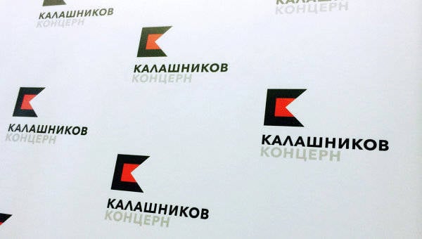
The corporate brand of the Kalashnikov Concern was created in accordance with the latest global trends. In the new logo, made up of two colors - black and red, two “K” - “Concern” and “Kalashnikov” merged together. Also, the new logo of the concern is the visual embodiment of the principle of firearms - the bullet flying out of the barrel, the same for all grocery brands of the concern. Designers also drew a parallel with the state flag of Udmurtia (where the main enterprises of the concern are located), which have identical color gamut.

In addition to the Kalashnikov Concern corporate brand, the Kalashnikov military weapons product brand was updated. The symbolic capital named after Kalashnikov has been rethought and preserved in the food brand. The philosophy of the founder of the concern, expressed in the slogan “Protecting peace”, formed the basis of all communications and the design system of this brand. The developers had a double meaning in this slogan: Kalashnikov’s weapons are the most massive in the world, several times faster than their closest rivals in terms of the number of manufactured products; at the same time, Kalashnikov’s weapons are created to maintain peace on earth, in individual regions and countries: it allows peoples to protect their sovereignty, the right to peaceful existence, and the right to independently determine their own historical destiny.

The key graphic element of the combat brand - its logo - also underlines the connection with the great heritage: it depicts an unmistakably recognizable part of the design of the legendary AK - its store.

For the purpose of international expansion, two other well-known trademarks, “Baikal” and “Izhmash”, have also been preserved and updated in the portfolio of the concern’s brands. Under the brand “Baikal”, which also has global recognition, all the production of civilian weapons is concentrated. Under the renewed Izhmash trademark, the concern will conduct operations in the sporting arms segment, since today Izhmash is the main Russian brand of biathlon rifles and other competitive and amateur weapons.
44 comments
Information
Dear reader, to leave comments on the publication, you must sign in.
  1. +23
    2 December 2014 14: 54
    Somehow miserable. The company logo for recognition must match the brand on the trunk. And here the devils are a mess, they have nowhere to give money to.
    1. +23
      2 December 2014 14: 59
      Brand rebranding what , somehow everything is saturated with foreign, but everything is about nothing, is it really impossible to speak RUSSIAN, tired of it already, so soon they will forget the Russian language !!! hiMoreover, if we proceed from the fact that the "Kalash'-national symbol good then why RUSSIAN IS NOT A NATIONAL SYMBOL ??? what
      1. Pervusha Isaev
        +16
        2 December 2014 15: 01
        Quote: kot28.ru
        Brand rebranding what , somehow everything is saturated with foreign, but everything is about nothing, is it really impossible to speak RUSSIAN, tired of it already, so soon they will forget the Russian language !!! hi


        and you think the media is who? any nerus therefore such words pop up ...
        1. BYV
          +4
          2 December 2014 15: 24
          depicts an unmistakably recognizable part of the design of the legendary AK - his store

          Maybe I'm blind? Although, with me and with avant-garde somehow ... not really.
          1. GDP
            +11
            2 December 2014 15: 49
            Another cut dough ...
            Trust effective managers, they know how to sell you air ...
            The logo sucks and does not carry any meaning, either patriotic, historical or professional.


            TV presenter Tina Kandelaki former girlfriend of thief in law Jaba Ioseliani - brand developer of the Kalashnikov concern? Does she have enough money to build a new mansion? Lord, give her this money just like that, since you have nowhere to put it and don’t entrust any more serious work related to the image of the country!
            1. +1
              2 December 2014 17: 57
              General Director of the Center for Strategic Communications “Apostol” Tina Kandelaki. Deputy Director for Interplanetary Communications Neugomonko-Balabolkin E.E. Deputy for Intergalactic Talking BB
      2. +8
        2 December 2014 15: 30
        This is an advertising article. This is how the advertisement is written.
        Take the usual phrase: A Tajik brigade in special uniforms and shovels was brought to a construction site to level the ground.
        Now the same phrase, but in an advertising version: "At the construction site, a group of foreigners immediately caught the eye, they were wearing comfortable, beautiful and appropriate clothing with labels from a well-known foreign company. And how courageous and, one might say, sexy, they smiled broadly, lightly and playfully tossed the ground with shovels on which stood the brand of one of the most well-established Western firms in the construction industry.
      3. -1
        2 December 2014 15: 33
        Quote: kot28.ru
        Brand, rebranding, somehow everything is saturated with foreign, but everything is about nothing, is it really impossible to speak RUSSIAN

        You can, of course, if you work primarily for your country and not for a foreign buyer.
        1. 0
          2 December 2014 21: 22
          Quote: BARKAS
          Quote: kot28.ru
          Brand, rebranding, somehow everything is saturated with foreign, but everything is about nothing, is it really impossible to speak RUSSIAN

          You can, of course, if you work primarily for your country and not for a foreign buyer.

          it's time to strain the meager brains of Western buyers - let them begin to learn the Cyrillic alphabet, otherwise they will spoil it completely - all the words are in Latin. Sanctions in your mouth, gentlemen, Western buyers, you like something Russian - read the name by letter. Do not teach hieroglyphs, they can also take a steam bath over our Word.
      4. +4
        2 December 2014 19: 20
        Quote: kot28.ru
        Brand, rebranding what, somehow everything is saturated with foreign, but everything is about nothing, is it really impossible to speak RUSSIAN

        yes that's just the point that it is impossible

        because in Russian it will be - CUT

        20 lemons on the letter "K" painted in Bandera colors
        this is nothing but a "cut" in Russian and you will not name

        but in English, just in the stream - "rebranding"

        crassivooo, blinnn
    2. Pervusha Isaev
      +7
      2 December 2014 15: 00
      negative
      Concern "Kalashnikov" introduced a new brand


      it’s good that I didn’t introduce new nonsense ...
    3. +5
      2 December 2014 15: 31
      This brand has delusional colors, the flag of the "right sector". For such a concern, it turned out to be beyond the power to sue the Kalashnikov children, drends and free money, so they decided something new in the style of modern trends, simple, modest but with meaning.
    4. +2
      2 December 2014 16: 13
      The logo, frankly, let's say, is not entirely successful, you can’t even say that high-level professionals worked.
    5. +2
      2 December 2014 16: 39
      Yes, someone normally welded. What is so incredible for 20 lemons in this logo?
      1. +1
        2 December 2014 16: 46
        20 lemons - in theory, this is not the price of the logo, but the price of all materials according to the brand book.

        Documentation, business cards, billboards (most likely they are not needed, therefore they did a video presentation), any souvenir, site update

        http://kalashnikovconcern.ru/ - here the price for the site can reach 1 rubles. (although if you order at a competition among freelancers, the price will be about 500 rubles) + they made logos for all departments, as I understand it, judging by the site

        and so on and so on, infographics, folders for documents, plastic cards, design of a sales office and premises


        But the price is ultimately unrealistic. Although of course everything is relative - if she was planted by layout designers and forced to revert all the documentation of the enterprise, all the instructions and all the rest of the material is hemorrhoids and is expensive yes.

        In general, xs.

      2. The comment was deleted.
  2. +9
    2 December 2014 14: 55
    it would be better to turn to designers with UVZ - a fairly strong team. And I’ll make such a logo in 5 minutes 3 variations.

    In fact, the red price of this logo is 1 p. Well, I would be dumb to ask for more for such a job.

    And so I think they normally took the money for development

    The rebranding was carried out by the Apostol Center for Strategic Communications, one of the three largest communication agencies in Russia.

    It would be better to contact the design studio.

    And I look at this logo - for the money they had to make their own font. And then they took Centuri Gothic - ready - made 4 geometric shapes - and voila

  3. -7
    2 December 2014 14: 55
    nice, progress compared to the previous logo))
  4. +5
    2 December 2014 14: 56
    Enough with these brands and ships! You have to make good weapons, and no brands are needed. The machine itself will say everything in battle !!!
  5. +8
    2 December 2014 14: 58
    How many words ... But all because of this:

    "Mikhail Kalashnikov, together with his daughter and grandson, founded a company in 1999, which since 2004 has owned a trademark in the form of a three-dimensional image of a machine gun with the inscription" AK-47 ". According to Rospatent, the company can use it in the production of clothing, hats, toys, slot machines and board games.

    The rights to this brand are valid until 2022, however, the Kalashnikov concern requires an early termination of the legal protection of the trademark. However, the court reported that the claim, filed back on June 16, has not yet been moved, since the applicant has not paid the state fee. "
    1. avt
      +3
      2 December 2014 15: 28
      Quote: GRAY
      How many words ... But all because of this:

      good Quite right! But the funniest thing is that this "rebranding" can be extinguished once in a court of law by removing the letters folded into a word - the surname and there will be only "The key graphic element of the combat brand - its logo - also emphasizes the connection with the great heritage: it is depicted unmistakably a recognizable part of the legendary AK's design is its store. " laughing As a trademark, well, the seller in a whisper to the buyer will say, "The same Kalashnikov". Ah! They can also, like with vodka but in the return, write - Kalashnikoff laughing Then the normalek will slip through with the ,, new brand "Or delirium from greed ??
      1. +2
        2 December 2014 16: 03
        Quote: avt
        Or delirium from greed ??

  6. +9
    2 December 2014 14: 59
    not impressive at all! A world-recognizable thing, and such a logo ...
    1. +2
      2 December 2014 17: 47
      And the money was well spent on such nonsense.
    2. The comment was deleted.
  7. +6
    2 December 2014 15: 02
    It seems to me alone that it looks like "Kaspersky"?
    1. +5
      2 December 2014 15: 48
      Quote: ferdiperdozzz
      It seems to me alone that it looks like "Kaspersky"?

      but in your opinion, Kalash is not an antivirus program ???
  8. +6
    2 December 2014 15: 04
    Brand, rebranding, naming, brand books, a set of foreign words, pieces of paper, stickers, t-shirts for 20 lyam, most likely budget, rubles. Well done Kandelaki, helped people to master the budget, and of course she got her kickback naturally. Is it possible to develop such a mujin is 20 lyamas? Go to any office that deals with printing and design in a provincial town, tell me what the name of the office is and what it does, and they will offer you 5 logotype options in 2 minutes for 000 rubles. In general, insanity grows stronger.
  9. +4
    2 December 2014 15: 06
    And how long have they been working on this HS? The square, black-red Pac-Man is somehow weakly associated with the legendary AK.
    1. Pervusha Isaev
      -8
      2 December 2014 15: 11
      Quote: Glaz8000
      Square, black and red pakman ka


      pakman- huyakman, isn’t it disgusting to write this yourself?
  10. 0
    2 December 2014 15: 13
    also not impressed
  11. 0
    2 December 2014 15: 14
    AK without any advertising is the most recognizable brand in the whole world.
  12. +4
    2 December 2014 15: 31
    Something there I did not see the most recognizable part of the AK - 47. Maybe you need to look in a mirror image or turn it 180 degrees? The trouble with these "rebranding". The blue-white-red emblem of the Russian army is still a pearl.
  13. +3
    2 December 2014 15: 35
    It is in this way that they want to rob the Kalashnikov family!
  14. +1
    2 December 2014 15: 39
    Some crap!
  15. 0
    2 December 2014 15: 43
    What is not an option?
    You can swap words.
    option_ "on the knee"option_ "on the knee"
    1. +3
      2 December 2014 15: 52
      Quote: Svetovod
      What is not an option?

      it started advertising on the road ....
  16. +3
    2 December 2014 15: 48
    Oh dear, at first a sawn two-tone star in the Russian army, now it’s still a square pacman on the Kalashnikov logo. request
  17. 0
    2 December 2014 15: 56
    What the ... Again, the super designer Lebedev did?
    1. 0
      2 December 2014 16: 28
      The fact of the matter is that not him!
  18. CRP
    CRP
    0
    2 December 2014 16: 03
    Something AvtoVAZ reminds)))
    1. +1
      2 December 2014 17: 38
      Quote: CRP
      Something AvtoVAZ reminds)))

      Well, you, Rasputin, confuse the Muscovite emblem with Lada?
  19. +4
    2 December 2014 16: 16
    Yeah - СBRANDOR with a new logo. Would be more suitable for the "right sector", because this uber logo lacks the right sector to a full square. About nothing. No connection with Kalashnikov. Even the letter "K" looks more like a fallen "P".
  20. lankrus
    +2
    2 December 2014 16: 20
    Sucks. The whole point of modern menagers. To take away, to saw and divide instead of to create, add and increase.
  21. +3
    2 December 2014 16: 23
    "The total cost of all rebranding work is 20 million rubles, including brand research and analysis."

    Don't suck 20 million for brand research and analysis, "Kalashnikov is a legendary weapon known all over the world." Everything is already known! What to investigate?

    And rightly so the previous speakers wrote about the color scheme - the natural "Right Sector"!
  22. +3
    2 December 2014 16: 34
    The key graphic element of the combat brand - its logo - also underlines the connection with the great heritage: it depicts an unmistakably recognizable part of the design of the legendary AK - its store.

    I almost broke my eyes, but did not find the "unmistakable part of the design".
  23. -1
    2 December 2014 16: 35
    -The right sector is bigger in the brain than in reality
  24. 0
    2 December 2014 16: 37
    They’re doing nonsense, they’ve almost got an order to re-equip the army, and they’re scattering grandmothers. If they make a machine at the level of AEK 973, then the letters AK will be outweighed in the competition.
  25. +3
    2 December 2014 16: 38
    In the photo are not those pictures:

    New brand on the concern website:
    http://www.kalashnikovconcern.com/
  26. +1
    2 December 2014 16: 43
    Quote: Tamod
    -The right sector is bigger in the brain than in reality


    In the sense of the logo is suitable for "pravosekov", in it and P and C at the same time, their colors. And all sectors except the right on the ground.
    Let them redeem.
    1. 0
      2 December 2014 16: 54
      The colors of the flag of Udmurtia and the Alice group. You should not find fault here. Better the composition of managers appreciate.
  27. +1
    2 December 2014 16: 55
    Quote: GDP

    TV presenter Tina Kandelaki former girlfriend of thief in law Jaba Ioseliani - brand developer of the Kalashnikov concern?

    That’s because they’ll crawl through all the cracks! What brand Kalash is a brand in itself! This cadillacs must have lost their brains at night, thinking and thinking fool and thought up
  28. 0
    2 December 2014 16: 56
    No, do not go.
  29. wanderer_032
    +2
    2 December 2014 17: 17
    Concern "Kalashnikov", part of the State Corporation Rostec, introduced a new brand. It is intended to help the manufacturer of small arms, which occupies 95% of the Russian market, more effectively promote products both domestically and abroad. (Quote)

    It is not a brand that needs to be "promoted", but modern and high-quality weapons.
    A good weapon does not need advertising; it advertises itself.

    Director of the Kalashnikov Concern Alexei Krivoruchko (quote)

    I would very well think whether to appoint a person with such a surname to such a position laughing , especially in an industry such as precision engineering (the manufacture of weapons is included in it).
    A surname can sometimes say a lot about a person, even if someone gave it to his ancestors.
  30. pinecone
    +1
    2 December 2014 17: 34
    The trouble is if such "design findings" are funded under the state defense order program.
  31. +2
    2 December 2014 17: 40
    Full crap!
  32. +2
    2 December 2014 18: 30
    It looked like a complete guano, in vain they regretted the money to buy the old brand from the Kalashnikov family, although 15 lyam is not the amount for which such things are sold. Every Papuan knows Kalash, which means something. This silhouette knows the whole world!