We do not understand anything in contemporary art! Doubtful logo for New Moscow for 15 million rubles
Last week, the center for strategic communications with the “modest” name “Apostle”, headed by Tina Kandelaki, reported on the creation of the New Moscow logo. A tender with an initial cost of more than 17 million rubles to create a logo was announced last year (2014) by such an organization as the state unitary enterprise Research and Design Institute of the General Plan of Moscow. It is clear that Moscow is not a city of the poor, and therefore, apparently ready to finance tenders to create logos on a wide, as they say, foot, but the amount of 17 millions even experienced designers with a hefty portfolio (recruitment of successfully completed works) caused some bewilderment. But the tender for that and the tender so that its final cost would fall at times due to numerous proposals from competing design centers, ready to do the job qualitatively. Therefore, initially a wave of bewilderment subsided. True, not for long ...
After some time, it turned out that the tender was won by the Apostle Center mentioned above, who “kindly agreed” to create a logo for “just” 15 million rubles ... Professional designers opened their mouths ... And the opening of mouths was due to the fact that no "Did not happen, and that such a price really somehow gives away the corruption potential of the whole transaction.
However, this wave also had to subside, as the design community expected from the Apostle an outstanding work in all respects, which would be a graphic symbol of New Moscow worth 15 million rubles. A creation in which both the scale of the Russian capital and historical milestones through which the city, developing, passed. They waited, waited, and, you know, did not immediately wait ... The deadlines for the execution of the order placed by the Research and Design Institute of the General Plan of Moscow came out, and the Apostle was clearly in no hurry to give the result. As a result, with months of delay, the following work was submitted to the customer’s court (accepted by the R&D Institute, it seemed like a bang):

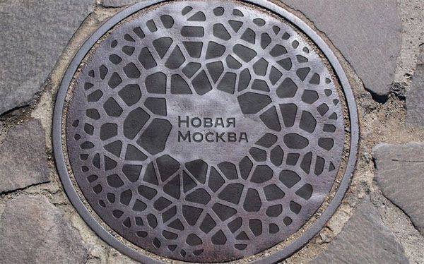
And after that, the professional design community was no longer holding back emotions. So, blogger Kirill Voronkov (professional designer) called the work of "designers" Tina Kandelaki "hack-work, evident even to the unprofessional majority", as well as "embarrassment and recognition of incompetence." The media community was completely lost in conjectures about what this logo symbolizes: either a dog, excuse me, poop (12 pieces by the number of elements on the "main" logo), or a reworked emblem of the Moscow Planetarium ...
One could, of course, consider that all these designer fights were not able to figure it out among themselves, and therefore they put sticks in creative wheels to each other, envying that 15 millions went to another pocket, and calling them nothing competitors in the design department ... But here the question of “human envy” still goes by the wayside for the simple reason that the blogger Voronkov discovered the source of inspiration for the design center Apostol in the public domain. As it turns out, the image of the authors of the logo of New Moscow could borrow on the site that distributes graphic templates templates for free download - link.
The most interesting thing is that the “Apostol” declared that all the accusations of frank plagiarism against them were false. Like, bloggers cast a shadow on the fence, and there was no download - we did everything ourselves! Just so coincided ...
Here is a statement by representatives of the center of strategic communications:
Commenting on this statement, professional designers shrug their shoulders and declare that they have never heard of such a “standard practice” that would call manual work on “natural patterns” inappropriate and recommend using only mathematically reproducing algorithms ...
The statement of the Apostle’s creatives intersects with the words of Ostap Bender in the work of I.Ilf and E.Petrov “The Golden Calf”:
If the one who “created” the logo of New Moscow was in place of Ostap Bender, then, apparently, he would say that such a poem “is formed organically, and for its artificial reproduction mathematical algorithms are required, which were used for writing ... "So the question arises: who is the greater" great combinator "- O. Bender or the Apostle strategic communications center?
However, God bless him with this logo ... There are much more questions for those who decided to launch such a tender at all, using considerable budget funds. After all, the same designers often admit that if the muse refuses to visit them, they resort to the help of freelancers who can build something like this in half an hour of work, having received far from her millions. Why didn’t there be at least one initiator of such a competition at the public level during the proliferating initiative groups of Moscow activists? Is it really the case that the corruption scheme has reached its tentacles and before this, it would seem, which has nothing to do with the cutting direction - the direction of creative services ...
By the way, the deal with the “Apostle”, as a result of which the money from the budget went to something similar to outright plagiarism, became interested in the parliamentary counting commission. So, deputy Alexander Ageev sent a request to the prosecutor's office about the need to verify the prisoner between the "Apostle" (the name is completely according to Bender) and the Research and Design Institute of the General Plan of Moscow.
There is only one conclusion: the work of the great combinator lives and thrives, and at the company “Horns and hoofs” branches operate throughout the country - from Moscow to the outskirts.
PS Center Tina Kandelaki was engaged in "branding" of the Kalashnikov Concern enterprise, developing the "brand" of the Mortgage Lending Agency, promoting the 11 of Russian cities to the World Cup 2018. Based on such information, it is time to rejoice that the tender did not cost the budget of Moscow in 15 BILLION rubles ...
After some time, it turned out that the tender was won by the Apostle Center mentioned above, who “kindly agreed” to create a logo for “just” 15 million rubles ... Professional designers opened their mouths ... And the opening of mouths was due to the fact that no "Did not happen, and that such a price really somehow gives away the corruption potential of the whole transaction.
However, this wave also had to subside, as the design community expected from the Apostle an outstanding work in all respects, which would be a graphic symbol of New Moscow worth 15 million rubles. A creation in which both the scale of the Russian capital and historical milestones through which the city, developing, passed. They waited, waited, and, you know, did not immediately wait ... The deadlines for the execution of the order placed by the Research and Design Institute of the General Plan of Moscow came out, and the Apostle was clearly in no hurry to give the result. As a result, with months of delay, the following work was submitted to the customer’s court (accepted by the R&D Institute, it seemed like a bang):
And after that, the professional design community was no longer holding back emotions. So, blogger Kirill Voronkov (professional designer) called the work of "designers" Tina Kandelaki "hack-work, evident even to the unprofessional majority", as well as "embarrassment and recognition of incompetence." The media community was completely lost in conjectures about what this logo symbolizes: either a dog, excuse me, poop (12 pieces by the number of elements on the "main" logo), or a reworked emblem of the Moscow Planetarium ...
One could, of course, consider that all these designer fights were not able to figure it out among themselves, and therefore they put sticks in creative wheels to each other, envying that 15 millions went to another pocket, and calling them nothing competitors in the design department ... But here the question of “human envy” still goes by the wayside for the simple reason that the blogger Voronkov discovered the source of inspiration for the design center Apostol in the public domain. As it turns out, the image of the authors of the logo of New Moscow could borrow on the site that distributes graphic templates templates for free download - link.
The most interesting thing is that the “Apostol” declared that all the accusations of frank plagiarism against them were false. Like, bloggers cast a shadow on the fence, and there was no download - we did everything ourselves! Just so coincided ...
Here is a statement by representatives of the center of strategic communications:
In nature, this pattern is formed organically, and for its artificial reproduction, algorithms that mathematically reproduce this method of partitioning space are used. Manually correctly portray such a pattern is almost impossible, and most importantly - it is inexpedient: if you deviate from the correct grid, the recognition of the pattern is lost. In this regard, to generate a Voronoi pattern, our designers used special software. This practice is generally accepted in graphic design.
Commenting on this statement, professional designers shrug their shoulders and declare that they have never heard of such a “standard practice” that would call manual work on “natural patterns” inappropriate and recommend using only mathematically reproducing algorithms ...
The statement of the Apostle’s creatives intersects with the words of Ostap Bender in the work of I.Ilf and E.Petrov “The Golden Calf”:
Listen to what I put on a lamp last night with the fluctuating light of an electric lamp: "I remember a wonderful moment, you appeared before me as a fleeting vision, as a genius of pure beauty." Really good? Talented? And only at dawn, when the last lines were written, I remembered that A. Pushkin had already written this verse. Such a blow from the classic! BUT?
If the one who “created” the logo of New Moscow was in place of Ostap Bender, then, apparently, he would say that such a poem “is formed organically, and for its artificial reproduction mathematical algorithms are required, which were used for writing ... "So the question arises: who is the greater" great combinator "- O. Bender or the Apostle strategic communications center?
However, God bless him with this logo ... There are much more questions for those who decided to launch such a tender at all, using considerable budget funds. After all, the same designers often admit that if the muse refuses to visit them, they resort to the help of freelancers who can build something like this in half an hour of work, having received far from her millions. Why didn’t there be at least one initiator of such a competition at the public level during the proliferating initiative groups of Moscow activists? Is it really the case that the corruption scheme has reached its tentacles and before this, it would seem, which has nothing to do with the cutting direction - the direction of creative services ...
By the way, the deal with the “Apostle”, as a result of which the money from the budget went to something similar to outright plagiarism, became interested in the parliamentary counting commission. So, deputy Alexander Ageev sent a request to the prosecutor's office about the need to verify the prisoner between the "Apostle" (the name is completely according to Bender) and the Research and Design Institute of the General Plan of Moscow.
There is only one conclusion: the work of the great combinator lives and thrives, and at the company “Horns and hoofs” branches operate throughout the country - from Moscow to the outskirts.
PS Center Tina Kandelaki was engaged in "branding" of the Kalashnikov Concern enterprise, developing the "brand" of the Mortgage Lending Agency, promoting the 11 of Russian cities to the World Cup 2018. Based on such information, it is time to rejoice that the tender did not cost the budget of Moscow in 15 BILLION rubles ...
Information