"It turns out quick work." Heraldry specialist with skepticism refers to the new versions of military symbols

95
"It turns out quick work." Heraldry specialist with skepticism refers to the new versions of military symbols

“Sergey Kuzhugetovich Shoigu is a good man, but for some reason he thinks that he is a great dock in all matters. And he makes sole decisions, ”said Leonid Tokar, a member of the Heraldic Council under the President of Russia, commenting on the new emblem options proposed by Defense Minister Sergei Shoigu in an interview with the VIEW newspaper.

By the end of the month, the Ministry of Defense intends to choose a new emblem for a military uniform. Earlier, Russian generals expressed their opinion on the presented options for the emblems, and last week the head of department, Sergei Shoigu, offered them to the attention of the Public Council under the Ministry of Defense. At the exit from the meeting room, a ballot box was installed.

The presented options were not liked by all members of the Public Council. The leader of the Moral Code group, Sergey Mazaev, immediately appealed not to hurry with the approval of the emblem, to which the minister replied: “Just do not tighten up; Then it will take time for a very large circulation, for tenders, and so on. ”

As a source in the Ministry of Defense staff explained to the newspaper VZGLYAD, "there is no talk of some kind of global rebranding." “We are not planning to massively change stars for tanks and airplanes. Those that are now on the equipment will remain on it. But in addition to combat vehicles, there is also a form. And not only the one in which they go to parades, field trips, but also for everyday wear. For example, T-shirts, tracksuits. The same souvenir products, ”the source explained.

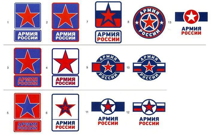
The fact that the Ministry of Defense chooses a new emblem, which will be applied to all army aircraft, tanks, ships and other military equipment, RBC daily reported earlier. According to the publication, 13 emblem versions were prepared: the star and the colors of the Russian flag are present in all versions.

In an interview with the VIEW newspaper, the emblem options presented by Shoigu were assessed by the author of many emblems of civil departments, a member of the Heraldic Council under the President of Russia Leonid Tokar.

VIEW: Leonid Nikolayevich, what requirements should be placed on the emblems of the armed forces?

Leonid Tokar: We already have an emblem of the armed forces - the emblem of the Ministry of Defense. Established by decree of the President of Russia No. 46 of January 27 1997, it is a two-headed eagle with outstretched wings, holding a sword in its right paw, and a laurel wreath in its left.

The emblem should be as simple as possible in order to apply it through a stencil, and at the same time to give an idea of ​​the equipment belonging to certain armed forces of a certain state, it should be easily recognizable.

And if it should be recognizable, was it not easier to turn to traditions? With 1918, we either used a red star or a red star with white trim. This emblem is traditional for the armed forces of the USSR. It is necessary not to invent a new one, but to use a traditional sign, especially since it is recognizable.

In general, the need for marking military equipment in Russia arose before the First World War, when the first copies of aircraft and tanks appeared. Our identification marks from that period are a white-blue-red circle. This circle appeared not by chance - it is, figuratively speaking, a ribbon of the colors of the national flag, assembled in a round rosette. Cockades looked like that, that is why identifiers on the technique of the pre-revolutionary period were also called cockades.

Then, when part of the airplanes turned to red, a star began to be planted on these white-blue-red circles, but this was a temporary measure. But the use of Soviet symbols is still not in doubt. Civil aviation The Soviet period was also indicated by this sign, and today Aeroflot uses the same emblem - wings against the background of a sickle and a hammer.

The projects presented can hardly be called emblems, most likely they are logos, because the words “Army of Russia” are graphically depicted here.

VIEW: Is it necessary to have the colors of the national flag on the military emblem?

L. T: Not necessarily. If there is a recognizable symbol, then why do we need the colors of the national flag? And the red star with white edging is associated with Russia, the star was used by the Americans, but there the star was white.

VIEW: Do not you alone say that the new emblem is a copy of the American version, some also point to similarities with the Chinese. Is this some kind of global rule for creating emblems, or is it just created without much imagination?

L. TA: Yes, of course, if you look at the 11, 12 and 13 options, removing the inscription “Army of Russia” and you open the identification marks of the Air Force of the American Army, all your questions will disappear by themselves - absolutely clear tracing paper with some changes. On the emblem itself, this inscription “The Army of Russia” is deeply incomprehensible to me, it again turns the emblem into a logo. The comparison with China is not quite right, the Chinese still have a yellow edging star, and more recently a hieroglyph is required in the center of the star.

Need to know history, heraldic traditions, otherwise a hack work. For example, while I was developing insignia for Russian Railways, designer Victoria Andreyanova was developing a uniform for railroad workers. During one of my visits, I was shown the work of her young designers - a jacket with a red ribbon with a white edging missed in the loop. I ask: "What is it?" They answer: "Well, ribbon, beautiful." I say: "Nothing that resembles an iron cross ribbon or a medal for a wound?" - "Oh, we did not think."

So in the case under discussion, they forgot to compare it with the American version. What I see in front of me perfectly illustrates that a person far from symbolism was engaged in this.

VIEW: Do the options from a purely visual, artistic point of view suit you?

L. TA: They do not like it. If you love a star, then let's star. She traditionally has the right to life. If you want something new without a star, we will return to the fact that there is an officially approved emblem that no one bothers to use on the technique. Don't you like her? Sorry, you accepted this. Then let's change the presidential decree.

When I design emblems, I try to get away from statehood. Because the emblem is created for many years and should not depend on the change of state symbols. I have been doing this for decades and have developed many departmental symbols. There are good departmental emblems that are worn for decades, no one is going to change them. Based on this, I - for a star on the technique.

# {weapon} VIEW: Sergey Mazaev admitted in an interview with our newspaper that he saw in this emblem Shoigu a "Kabbalistic sign." “If an inner circle is drawn from the center of the star, then the outer corners should be a little more obtuse, such as the Hero's Star was - it is rounder, kinder, wider, and the sharp straight geometric star - this symbol is taken from Kabbalah,” explained Mazaev. How seriously can you take such a reproach?

L. TA: Mazaeva can be excused, he does not know that the stars were different. If we consider the stars that were used as a emblem for a headdress, the rays were sharp, wide, narrow, and even oval-pointed. There were lots of options. Therefore, the star is a star, as you draw, so it will be. If we take as an example the Star of the Hero of the Soviet Union, then such an outline was inherent in it.

On the presented projects in the 9, 10 variants, a star is depicted in just such a pattern that has been applied to our aircraft for many years. The 6 version was also. It was used on sleeve insignia in the 1922 year, when the internal was drawn in black with a red outer star.

VIEW: Who generally should be engaged in the creation of emblems at the state level?

L. TA: To carry out a unified state policy in the field of heraldry, in 1999, the Heraldic Council under the President of the Russian Federation was created, of which I am a member. According to the regulation on the council, the symbols of state bodies are being coordinated and examined in the Heraldic Council. There are experts in it.

Sergei Kuzhugetovich Shoigu is a good man, but for some reason he thinks that he is a great dock in all matters. And makes sole decisions. In the Ministry of Defense there is a heraldic service. I do not understand why this issue should be discussed at the Public Council when there is a Heraldic Council under the President of Russia. Of course, many are grateful to the Minister for having returned the shoulder strap to the field uniform on his stomach.

But then comes the so-called office form. Quiet horror that they have stuck. This is a separate conversation. What is an office form for? Field - it is clear. Any form of clothing has practical functions. If you take the 1812 year - there are different beautiful uniforms. What was it for? Not because it was beautiful, but so that the commander-in-chief could see the troops on the field and lead them. Then the bright form served to facilitate the control of troops on the battlefield.

As soon as we have an automatic weapon and a weapon with a long range of fire, we have the need to disguise. The British were the first to encounter this during the Anglo-Boer War, when the troops suffered heavy losses due to the fact that the uniforms were red - and were noticeable in the field. Camouflage appears.

There is still a dress uniform. When they say that it should be comfortable, it makes me skeptical smile. The dress uniform should be beautiful, show the power of the army, and it can be uncomfortable.

There is, in turn, also a daily form in which you can work absolutely comfortably in headquarters or now in offices. Therefore, the appearance of the office form is absolutely incomprehensible to me. Moreover, our military leaders in it resemble representatives of African or Latin American countries. Initially rich sewing on headdresses was intended only for dress uniform. In everyday form there was not much sewing. And now look at the office cap. It is completely embroidered, there is simply no place for living. Why embroider it?

The passion of Sergey Kuzhugetovich to decorate his uniform with stripes is already a talk of the town. There are unwritten rules for creating a uniform. There are experts who can tell you how to do it right.

Many subordinates are afraid to express their thoughts to high authorities, but I am a free man and I can defend my opinion regardless of the position held by the interlocutor, be it the Minister of Defense or even the President. And as a specialist, at least I will.
95 comments
Information
Dear reader, to leave comments on the publication, you must sign in.
  1. HOUSES
    +6
    26 September 2013 17: 09
    Office uniform ?! Cool. East is a delicate matter.
    1. soldat1945
      +22
      26 September 2013 18: 48
      He wrote in the previous topic, Shoigu the pagan hangs us with colored rags so that evil spirits do not dominate and there is no evil eye !!!!! The office uniform is generally the average between the Ministry of Emergencies and the Chinese army
      1. +6
        26 September 2013 20: 58
        He neighed over some comments of the comrades, I especially liked it, return Serdyukov))))
        Well, I don’t want to write anything about the Shaman, honestly, there will be no sense from this Minister ...

        I now want to raise a question on the individual armor of a soldier .....
        Bullet-proof vests, helmets, shoes, gloves ... the level of personnel losses depends on clothing (as well as on training)) - this should be done, and not come up with logos with the unknown wording "Russian army" - where is this written in the charter ???? ????????

        In ancient times, the Knights swam in armor, ran, fought, then People were treated like human beings ....
        and Wait "dancing with a tambourine" in the media)))))))))))
      2. +9
        27 September 2013 08: 37
        Quote: soldat1945
        Shoigu the pagan hangs us with colored rags so that evil spirits do not molest and there is no evil eye !!!!!

        Shoigu goes on demobilization? )))
      3. 0
        28 September 2013 11: 17
        And the star is used by the Satanists.
    2. predator.3
      +36
      26 September 2013 18: 49
      half of what has been painted reminds of road signs, the other half copies state attributes.
      1. +9
        26 September 2013 19: 41
        Unfortunately not. What resembles road signs is also removed from US paraphernalia. And the US one, unfortunately, is better matched in color. Well, the rest are again the US Air Force ... and the Zvezdochka balm. We would have left the symbolism alone. There is a star. On T-shirts, you can simply do it with a contour with a slight difference in shade. It will be worthy and not so screams
        1. s1н7т
          +2
          27 September 2013 06: 03
          Quote: Bronis
          There is a star. On T-shirts it can simply be done with a contour with a slight difference in shade. It will be worthy

          It was like that once. And the inscription was - USSR Armed Forces. Very good it was worth it! soldier
    3. Airman
      +7
      26 September 2013 23: 09
      Quote: HAUSER
      Office uniform ?! Cool. East is a delicate matter.

      Now the reformist "itch" of each defense minister leads to a change in form, and Shoigu decided to go further and swung at the symbolism. Isn't there a smart person who can stop him? It is funny for me to look at these parrots discharged with gold embroidery, especially at his retinue from the Serdyukov bl ... th battalion, especially at the "generals"
      1. +2
        27 September 2013 11: 56
        I agree completely ridiculously, a young aunt, deputy minister and general of the army .... Nothing has changed. I also said at the very beginning that there would be no sense from him. Everything bl .... passed to Seryukov’s inheritance to Shoigu, A he was a place where he would be interested in rebuilding troops and embroidering. Yes, and in what form the Ministry for Emergencies showed the events in D. Vostok and Transbaikalia. Again, all the troops disentangle. hate.
    4. +1
      27 September 2013 06: 23
      some kind of usa.shny shade on the nameplates, mixed with glamor negative
  2. smiths xnumx
    +30
    26 September 2013 17: 12
    Insanity and nonsense.
    When the cat has nothing to do, he licks the eggs.
    If there are no other problems in the army, then it's time to do rebranding.
    The upper options are some branches of CSKA, the rest has nothing to do with Russia.
    At the same time, the emblems for the equipment should be recognizable in monochrome. The faceted ("Kremlin") star copes with this without any problems.
    And there is no intersection with the United States and China.
    And of course, our two-headed man didn’t please him if the red race was so disgusting to them.
    And here - some kind of Indonesia or Korea.
    Return Serdyukov! (tm) :) fellow
    1. +7
      26 September 2013 18: 29
      HERE and I think ... than the star does not like. The red star has seen more than one war ...
      Why be wise. And the inscription “The Army of Russia” in general killed ... that is, for one red star in this particular case it is not clear what’s whose army? ... or is it as a brand? ...
      P.S. He returned from vacation, and here is the news))
      1. +8
        26 September 2013 19: 09
        Quote: il grand casino
        HERE and I think ... than the star does not like. The red star has seen more than one war.


        But how can some responsible people steal the budget? So they come up with all kinds of contests in order to achieve their goal. Just remember how many times they changed their clothes. It's huge finances.
        1. +1
          26 September 2013 20: 02
          Quote: lonely
          Quote: il grand casino
          HERE and I think ... than the star does not like. The red star has seen more than one war.


          But how can some responsible people steal the budget? So they come up with all kinds of contests in order to achieve their goal. Just remember how many times they changed their clothes. It's huge finances.


          I didn’t think ... All the time I forget that you need something, somewhere to plunder ...
        2. +1
          26 September 2013 21: 29
          Quote: lonely
          The presented options were not liked by all members of the Public Council. The leader of the Moral Code group, Sergey Mazaev, immediately appealed not to hurry with the approval of the emblem, to which the minister replied: “Just do not tighten up; Then it will take time for a very large circulation, for tenders, and so on. ”

          Read carefully, the article clearly says why change the logo.
      2. 0
        27 September 2013 07: 11
        Quote: il grand casino
        ... than the star does not like. The red star has seen more than one war ...

        Not politically correct. As if hinting at the succession of the USSR and the future terrifying appearance of the EAC belay
    2. +2
      26 September 2013 18: 31
      Indeed, somehow solid. 11 and 12 are generally similar to American characters.
      1. +24
        26 September 2013 19: 02
        "Eccentricity", and only .... request
    3. HOUSES
      +9
      26 September 2013 18: 41
      The double-headed eagle is good for the coat of arms, and for the emblem archaic. Red star, with a hammer and sickle. There is an iron cross at the Bundeswehr and nothing, although it has been tradition as a state award for 70 years now.
  3. +25
    26 September 2013 18: 09
    Right now we will change the emblem - and that’s it, khan to the enemy. The immortal movie of DMB:

    "While the enemy is drawing the maps of the offensive, we change the landscapes, and manually. When the time comes for the attack, the enemy is lost in unfamiliar terrain and comes into full non-readiness."
    1. +3
      26 September 2013 21: 27
      Quote: Stiletto
      Right now we will change the emblem - and that’s it, khan to the enemy. The immortal movie of DMB:

      "While the enemy is drawing the maps of the offensive, we change the landscapes, and manually. When the time comes for the attack, the enemy is lost in unfamiliar terrain and comes into full non-readiness."

      You need to go as chief of the General Staff !!!!! + you laughed heartily laughing
  4. Saharok
    +13
    26 September 2013 18: 21
    Red Star, Hammer and Sickle !!! these are the true symbols of our valiant army.
    I can already imagine how they will howl in Poland and Spratland from such a symbol. =)

    And if on the topic, then I do not understand something than the old characters did not please ???
    First, we need to decide how necessary these changes are and it would be desirable
    to attract the public to the choice of a symbol, and then the bourgeois do not choose any damn ....
    1. +7
      27 September 2013 05: 04
      Red Star, Hammer and Sickle !!! these are the true symbols of our valiant army.
      1. 0
        27 September 2013 17: 33
        vladimirZ, oh, how wrong you are. There was already the Soviet Army and how it collapsed with the USSR, no need to tell. The fact of the matter is that building a new Army is necessary not on the basis of communist nonsense, but on original Russian values, especially on the Orthodox traditions of the Russian Army. The restoration of the Armed Forces is necessary, by the way, this is prescribed in the Directives, on the basis of the great history of Russia and its Army.
        It would be a very big mistake to restore the Soviet Army, and then again begin to fight bullying, a gradual movement to the downfall ...
  5. +10
    26 September 2013 18: 27
    That's interesting, the one who drew these labels, like a Russian. If you accept these pictures, it is only on the sole of the boot, so that the print is clear.
  6. +11
    26 September 2013 18: 28
    Like every pinjak Kuzhugetovich loves a military uniform and all tinsel to him laughing
    1. Airman
      +10
      26 September 2013 23: 30
      Quote: voronov
      Like every pinjak Kuzhugetovich loves a military uniform and all tinsel to him laughing

      During the service I noticed one peculiarity - the worse a soldier serves, the more colorful his demobilized uniform, a bunch of "aiguillettes", galloons and a multitude of undeserved signs, including "Guard", and vice versa, a good soldier leaves in his usual uniform without decorations. So this "tinsel" is suggestive.
      1. German
        +3
        26 September 2013 23: 45
        and indeed it is!
  7. +4
    26 September 2013 18: 28
    is that on the emblems for the zakas under amer? Do we need it?
  8. vkrav
    +9
    26 September 2013 18: 29
    Yeah ... Red and blue somehow mate badly ... Even on the emblem. Yes, and 6 of the thirteen emblems are too "based on" the US emblems:
  9. +3
    26 September 2013 18: 30
    Like every civilian Defense Ministry loves a military uniform and all tinsel to it
    1. waisson
      +1
      26 September 2013 18: 45
      Christmas tinsel
  10. Saharok
    +1
    26 September 2013 18: 36
    no, if there are only these options, then 4 and 7 still did not go where ... again, if the "Army of Russia"
    to remove.

    I personally cannot understand why this "Russian Army" is needed as an inscription ??? It turns out that the colors of our flag are not recognized in the world ???
    1. +1
      27 September 2013 12: 18
      Of course they don’t know - everyone recognized the USSR flag everywhere, there weren’t others like that. And these stripes - like the horse us-l. The flags of the Amers and the Britons, the Chinese, too, recognize the Great Power very different from the mattresses, and the Flag should be recognizable to everyone. RETURN FLAG, RETURN FORM.
  11. +4
    26 September 2013 18: 38
    Coloring like the DPRK.
    1. +1
      26 September 2013 19: 24
      That's for sure! The same association arose immediately.
  12. +17
    26 September 2013 18: 40
    Nowadays, Kuzhugetov cockades and other embroideries remind of the "banana" generals. I would like to return the Soviet classics. However - dreams ..
    1. 0
      27 September 2013 14: 25
      Symbols are needed, but why Soviet, now a different country, a different army, so the symbols are different. One thing is a star - a worldwide military symbol, but a sickle and a hammer ... a symbol of a non-existent party, country and ideology.
  13. +19
    26 September 2013 18: 42
    What can you do ..... First, they introduced Latin American caps with a high crown, where there SSovtsam. Then the imperial "chicken" was added, in the absence of an empire. They march in shirts and trousers for release and shoes. Not an army but a Merlison ballet. How to fight? Again, not with the help of some mother and on bare patreo? Again, the "office" generals and commanders do their best without a button accordion ....
    1. 0
      27 September 2013 14: 22
      In vain you are talking about a two-headed eagle, this coat of arms has a centuries-old history, dating back to the Principality of Moscow.
  14. waisson
    +8
    26 September 2013 18: 44
    it’s more difficult for a man who didn’t serve in the army than one was a furniture maker, the second son of a school boss, they always gravitated to amers; all this can be seen in the emblem stripes (accessories), just looking and presenting the fifth column of amer with huge crabs on caps we cannot cherish and be proud of our
  15. ilya63
    +9
    26 September 2013 18: 48
    removed, but did not put the thief-serdyuk, put a civil eccentric (on m)
  16. +2
    26 September 2013 18: 53
    And there is such an ointment called an "asterisk"!
  17. +9
    26 September 2013 18: 56
    Turner is a smart man; I fully support his opinion.
    And Shoigu is an ordinary party apparatchik, promoted by the media for unknown merits. So far, he has only the return of shoulder straps on his shoulders (skeptically: "huge" merit!); but the liability is replenished. He created Latin American clowns from the uniform of the Ministry of Emergency Situations, the same awaits the Russian army.
    The symbol of our army should be the "red star"!
    And in general: in the army now there are many problems, and these nerds from the Moscow Region are again busy creating a new form. This is an indicator of the level of intelligence for modern military commanders. A week ago, the commander of the unit ordered us to hem work robes and hang emblems on the collar. Well, not a nerd? Work robes for maintenance of equipment !!!
  18. Cat
    +8
    26 September 2013 19: 00
    Among other things, chevrons for military uniforms are not only valuable fur and show-offs for demobels, it is also a certain amount of budget money for the manufacture of these very chevrons. A good, cozy amount, a bentley with ferraris to buy as much as you can. Or rent a dacha in the Moscow region. Or to pay for the children to study at the English vocational school. There are a lot of options. So they started this, not in the presence of children, it will be said, rebranding. And the fact that the deadline is "for yesterday" is so that competitors do not hurry up and do not offer to change theirs. No, well, the "necessary" contractor will stamp the chevrons, but you never know, suddenly you have to make a different picture, new paints, except red and blue, to buy, extra costs ... Just look - the dacha will be on the floor below, or bentle is half a meter shorter. Not good, in general, it will turn out, yeah.
  19. +6
    26 September 2013 19: 03
    The most beautiful and recognizable military uniform is the form of the end of the war and there is no need to hang trinkets on the head start. It is necessary to reintroduce the buttonholes, normal and beautiful emblems of the military branches, instead of today's TINS ​​from cans!
  20. +18
    26 September 2013 19: 13
    - Leaving traditions gave birth to monsters! What was the cost of a "Grachevskaya" cap, the size of a satellite dish! And there is something to take an example: http: //topwar.ru/uploads/images/2013/252/ybbd167.jpg
    1. +1
      26 September 2013 19: 25
      - And if you want a parade, there are options: The ceremonial headgear of the Hussars, Major General Godlevsky regiment 1796-1801. By the way, these stamps for sports suits were going to be sculpted ... even the Americans don’t have this, it just says army or fleet. Another thing is if it is applied to mugs, towels, or some souvenirs. smile
      1. phantom359
        +1
        26 September 2013 22: 26
        But this is already too much.))
        1. +2
          27 September 2013 01: 06
          - Well then ...
          1. +1
            27 September 2013 12: 32
            Well this is Nikitushki Mikhalkov’s hat!
          2. 0
            27 September 2013 14: 20
            For the guard of honor it is.
    2. phantom359
      0
      26 September 2013 22: 25
      Quote: saygon66
      - Leaving traditions gave birth to monsters! What was the cost of a "Grachevskaya" cap, the size of a satellite dish! And there is something to take an example: http: //topwar.ru/uploads/images/2013/252/ybbd167.jpg

      Yes, as a parade and everyday will go. Nothing extra.
    3. history
      +5
      27 September 2013 01: 56
      The army must be loved and respected! And dressed and shod should be of high quality and tasteful. And according to tradition! Already the Russian Army does not need to be either someone or take an example! Let others take it!
      Why are we collecting any rubbish from the West? The British honor their traditions, are proud of them, and we are all looking for where to bury more money, not where necessary!
      Of course, weapons and personal safety come first, but the appearance (form, attributes) is not the last thing. It is not enough that the professional warriors were removed from the leadership, for how many years the Serdyukovs had been driving, they also do the mummers! The most interesting thing is why?
    4. +1
      27 September 2013 05: 15
      Replace cockade !!!
      1. 0
        27 September 2013 14: 19
        The crossed cockade is not military, but the Ministry of Internal Affairs.
    5. +3
      27 September 2013 12: 31
      I always believed that officers had the most beautiful form before the revolution.
  21. +7
    26 September 2013 19: 20
    Insanity grows stronger! At this pace, we will soon recall Serdyukov with a kind word ...
  22. +1
    26 September 2013 19: 22
    Sane people in Russia are not extinct. It's good. Amer’s wings and beer caps will not be.
  23. +5
    26 September 2013 19: 28
    The presented options were not liked by all members of the Public Council. The leader of the Moral Code group Sergey Mazaev immediately urged not to rush to approve the emblem, to which the minister replied: “Just do not delay, until the end of September we must choose the emblem and approve it. Then it will take time for a very large circulation, for tendering and so on».
    It’s bad that the color of the stars depends on the color of the stars on our military, but it’s understandable, because of which all this ficus picus.
  24. The comment was deleted.
  25. +5
    26 September 2013 19: 47
    Not ice at all, it seems that some "own" designers were working. Smells like a saw cut. I wonder how much they paid for the work on these logos.
  26. pinecone
    +9
    26 September 2013 19: 49
    The minister’s particular addiction to blue, one of the sacred colors of the Mongolian people, is noticeable.
  27. +9
    26 September 2013 19: 54
    I already wrote about this symbolism in a similar article ... The symbiosis of the USA and the DPRK ... The Red Star has long earned the right to be an irremovable emblem like a German cross beam ... Refusing legendary and recognizable paraphernalia is, so to speak, a big sin ... Why fuss and do unnecessary rebranding if there are well-deserved symbols that have passed fire, water and copper pipes?
  28. Mikado
    +7
    26 September 2013 20: 01
    Well, as I understand it, from the article, they don't want to paint these emblems on tanks with airplanes (new stars are already being drawn on them - a red star with white and blue edging, in principle, a good emblem, a tribute to traditions), but they plan to rivet on souvenirs, on pens there, on key chains, T-shirts, caps, jackets. In the USA, after all, the soldiers even have "US Army" written on their shorts, so Kuzhugetovich wants now on our "attributes" to have the inscription "Russian Army". Current for the same souvenirs, as for me, is still better to draw a Star. In general, I heard a story that as soon as the Union collapsed, the amers immediately bought for themselves various Soviet equipment, including the Mi-24, and he had a red star on his belly. So they were used during exercises, when a couple of Mis unexpectedly flew to the units of American soldiers on the march from behind a forest or because of a pea, and so even in their native land, the Americans, at the level of instinct, bent to the ground from the sight of Mi and a star from him on the belly, so there is no need to change the star, I think, let them be afraid, but from these emblems everyone will only laugh. And the office uniform is, of course, a tryndets, Shoigu has suffered something, she is completely licked off the form of the Ministry of Emergencies, I understand that he was still sitting in his old ministry and got tired of wearing a tie, so he introduced this uniform, but it doesn't look at all. He introduced civil servants of the Ministry of Defense a uniform with shoulder straps like the military, only with a white piping, now his deputy women with general shoulder straps are flaunting.
  29. +4
    26 September 2013 20: 16
    I always thought that the main thing was not uniform and all sorts of things. The main officer’s bearing (which has been formed over the years). Wearing it in any clothes, you can still see that a staff officer! In general, the White Guards (in Soviet films) always liked me in uniform !!
  30. +2
    26 September 2013 20: 21
    Long ... hmm!
  31. +1
    26 September 2013 20: 26
    There is no need to be a general in order to sweep away this banana husk.
  32. +14
    26 September 2013 20: 26
    Strange. Well, why is it always obvious to the whole people understandable and natural like air, and those who are in power in an attack of activity go blind, deaf, dull and lose all connection with reality? I understand if the military, the population of the country and the military of other countries were indignant: " What kind of Star? It is completely unclear what kind of sun it belongs to! "And they would have held a competition among artists and connoisseurs of heraldry. But here Shoigu's friend obviously fired all 13 blots over a bottle of vodka. First, create an Army! So that the S-500, Pantsiri and Voronezh-M stood along the entire border, so that the Armats were listed as divisions, so that the new Migi and Sushki and Yaki were really combat-ready units! That's when there will be something to draw on, then you can return to this issue. purely rhetorically))
  33. +2
    26 September 2013 20: 42
    Quote: Manul
    Strange. Well, why is it always obvious to the whole people understandable and natural like air, and those who are in power in an attack of activity go blind, deaf, dull and lose all connection with reality? I understand if the military, the population of the country and the military of other countries were indignant: " What kind of Star? It is completely unclear what kind of sun it belongs to! "And they would have held a competition among artists and connoisseurs of heraldry. But here Shoigu's friend obviously fired all 13 blots over a bottle of vodka. First, create an Army! So that the S-500, Pantsiri and Voronezh-M stood along the entire border, so that the Armats were listed as divisions, so that the new Migi and Sushki and Yaki were really combat-ready units! That's when there will be something to draw on, then you can return to this issue. purely rhetorically))

    Great wrote! exactly.
    1. ivachum
      +2
      26 September 2013 21: 20
      It's difficult ... but the rags are new, it's easy! I remember how we swore altering shoulder straps in one night. But some people cheerfully reported: "The troops have switched to a NEW uniform!" And it is still not in the warehouses, it’s new. The "old" one with a shoulder strap "on the belly" is still issued.
  34. +7
    26 September 2013 21: 04
    And why the hell ... then we need the Heraldic Council under the President along with the heraldic service of the Ministry of Defense, if this is r ... they are trying to convince us almost like a fait accompli? Dustless warm sinecure, I suppose.
    1. 0
      27 September 2013 14: 17
      He returned the Shoigu and the red star to his epaulettes, contrary to the decree of the president.
  35. +3
    26 September 2013 21: 08
    “Sergei Kuzhugetovich Shoigu is a good man, but for some reason he believes that he is a big dock in all matters.

    A terrible disease of all the big bosses. God save us from this!
  36. The comment was deleted.
    1. +4
      26 September 2013 21: 27
      -And then! Wing officer hat of the times of Alexander III - the form of this period was considered the most practical and most beautiful in history ...
      1. s1н7т
        0
        27 September 2013 06: 15
        And what is practicality ?! I do not agree.
        1. +1
          27 September 2013 10: 12
          boots, harem pants, gymnast - a very practical form
          1. 0
            27 September 2013 11: 05
            - Yes sir! The "tunic" introduced at that time lasted in the army until the 70s, and the color of the uniforms was "sea wave" or "ultramarine" until the 90s!
      2. s1н7т
        0
        28 September 2013 20: 05
        And what is practicality ?! I do not agree.
  37. The comment was deleted.
  38. +1
    26 September 2013 21: 26
    Guards Headquarters Officer Badge of the 1701 model of the year: Much more correct and accurate.
    1. +2
      26 September 2013 21: 51
      - This thing is called gorget. It was worn around the neck as a distinction sign of some regiments. Your sign belonged to the Transfiguration or Semenovts.
  39. The comment was deleted.
  40. -3
    26 September 2013 21: 40
    No. 7 is the most optimal of those proposed above.
    1. The comment was deleted.
  41. Vladi_S
    +2
    26 September 2013 21: 50
    Sergei Kuzhugetovich Shoigu is a good man ... But with emblems, Serdyukov reminded me of that. Or does he already see himself in bonapartes?
    1. +4
      26 September 2013 22: 49
      Unfortunately, or maybe not - there is no "good man" position in the Ministry of Defense. All the same, you need to think with your head, and you don't "tamper" yourself, consult at least with professionals who "ate the dog" on the topic.
  42. Vladi_S
    +3
    26 September 2013 21: 53
    Here you can see in form, uniform and a little heraldry: http://www.opoccuu.com/
  43. +1
    26 September 2013 21: 56
    In short, they change the shape and signs to the point that the soldiers will no longer recognize who their who is a stranger .. Angers me all this !!!!
  44. +3
    26 September 2013 23: 15
    why do all ministers start their work by dressing up a soldier?
    1. 0
      27 September 2013 07: 21
      Yes, it’s easier to promote ...
  45. Aleksandr2103
    +5
    26 September 2013 23: 48
    It may be enough to mock the military and spend money to no purpose. The new minister is already starting to make me angry that he makes painted clowns out of the military.
  46. Dober
    -4
    27 September 2013 00: 02
    Would you drive these "lazy tykarevs" from all the advice with a filthy broom ...
    They will not only beat you "red Solomon stars" on the lobes, but they will also force you to build a temple in the form of a pentacle on the site of the Kremlin ...

    "Wait for someone-I-a-a-a-a-and-and"
    / nedotyomka Novodvorskaya /

    And what kind of salivation the "new Soviets' im-peppers" have ...
    If only the two-headed eagle was mentioned in their "searches" ...
    The Racean Army - it will certainly happen, but not before the ruler changes. The only thing about this is to lick oneself ... -
    And so on the photo characters others...
    1. +3
      27 September 2013 01: 00
      welcome!
      it seems to me that in order to try on the historical contradiction of the Reds and the Whites and put a bullet in historical wars, we must use both the eagle and the star together in symbolism
      as one character from the movie used to say (election day) - combine brands, so to speak)
      here I drew a quick sketch))
      1. Dober
        0
        27 September 2013 01: 59
        Quote: regressSSSR
        try on the historical contradiction of red and white and put a bullet in historical wars in symbolism, you must apply both the eagle and the star together

        But Utopia is Dim ...
        The dispute between the Russian military banner with a two-headed eagle or the image of the Savior and the red banner with a five-pointed star is an eternal dispute between God and his absurd creation rebelled against Him, between the Creator of the world, and his molester, between Christ and Antichrist. Primitive images are behind the images, great beings are behind the symbols, and for the sake of loyalty to them and their connections with them, people are ready to sacrifice all their wealth and their very lives. What you bow to is what you connect with. And it’s not at all the same with what, or rather, with whom Russia will seek spiritual unity — with the Lord of Truth or with the father of lies. At the beginning of the twentieth century. our people, for the most part, have already bowed to Satan and God forbid us to commit this disastrous crime again.

        In 1920, before the evacuation of the Russian Army from the Crimea, General Wrangel, one of its officers, Count N. Zubov prophetically wrote:

        "Years will pass and a bloody whirlwind
        Rushing away from us forever -
        Double-headed eagle takes off again
        And the red star will perish. "

        The prophecy came true in 1993.
        Unfortunately...
        Quote: regressSSSR
        here dashed off a quick sketch))

        Thanks, of course. But already done -
        Only the "designer" apparently understands the symbolism. Pentacle NOT RED (bloody)...
        1. +1
          27 September 2013 04: 22
          Thanks, of course. But already done -

          did not see!
          Well, just do well the author looks good! well, at least from an artistic point of view!

          why not apply by the way?

          But Utopia is Dim ...


          I understand all this, of course, it can do everything, and so, but where then to put on 80 years as a whole, all the same, a heroic past! victory in World War II on fascism, which carries far more threats than the Union (then it turns out that evil defeated yet another evil, and maybe it was created for this) and the flight of Gagarin who has entered the history of the world with this symbolism where to put it now is all our history until the way to trying and creating is found, we will stagnate

          (good kindred with violence will inevitably degenerate into evil - and all the more dangerous because it still considers itself good! quote B. Strugatsky Grad Doomed) - this is about the United States today that are not true, but they build a polyteque precisely on faith in God and unwittingly disguised as this (slogan) and at the same time trying to distribute the 3rd world and stand up to no one else's lesser evil destroyed by the great USSR is dead! that's how somehow we live our whole life is the struggle of the least evil with evil! and the truth of true good and faith can be carried by each person separately but not by the masses as a whole! but maybe I don’t know
          (okay, something went wrong to me in the potential for philosophy)

          I apologize by the way I wanted to ask everything and is the satellite you too, or am I mistaken?
          1. Dober
            0
            28 September 2013 12: 52
            Quote: regressSSSR
            By the way, I wanted to ask everything, is it you too, or am I mistaken?

            Sorry, I didn't get it. What a "satellite" ...
            In terms of invented, built, launched, shot down ... laughing belay
            Nah, not me. So you are mistaken. hi
        2. +1
          27 September 2013 20: 48
          Dober
          The dispute between the Russian military banner with a two-headed eagle or the image of the Savior and the red banner with a five-pointed star is an eternal dispute between God and his absurd creation rebelled against Him, between the Creator of the world, and his molester, between Christ and Antichrist. Primitive images are behind the images, great beings are behind the symbols, and for the sake of loyalty to them and their connections with them, people are ready to sacrifice all their wealth and their very lives. What you bow to is what you connect with.


          Well, just do not quite agree with this, the star designation symbol is more ancient than the one used for Christianity and originally not carrying any negative energy, but rather just a bit of a symbol, we adopted dark cults and gave it a completely different semantic informatics as the Nazis ruined the innocent the Slovenian sign of the Solntsevarot having accepted it at their service (and if they had won now, this sign would have hung over half the world and you would have lived in a completely different Germany and it’s still unknown how you imagined this new world)) I believe that everyone who accepts this or that another ancient symbol itself gives him strength and power, and from the Tago as someone who applies this symbolism to power and authority, the sign of this symbol will depend! (with a + or - sign)
          maybe initially the USSR was created as a state of evil (from the point of view of the church), but with good intentions it may be better than the God-chosen people of the United States created as the state of good and freedom and those who carry evil to the world! and the civolica itself has nothing to do with it: it reflects what they are doing, what is the point of putting it into their version of it, it’s a long-reincarnated symbol of the Masons in the ancient world of Arabia, borrowed from its time
          and as early as 20 years the two-headed eagle returned, the church returned and living well, purely from a spiritual and ideological point of view, it was better that the late USSR was much worse in such an avant-garde than the mess! Of course I wish the country only good and prosperity in general we will wait and see which symbol will rule the world and I hope not Masonic))

          (by the way, they heard the news just by the box showed these same forces of evil (USA) found water on Mars under the ground))

          (picture and wiki pedia solin southern slovenians)
          1. Dober
            +2
            27 September 2013 23: 16
            My greetings, Dima! hi
            Quote: regressSSSR
            star designation symbol more ancient

            My fault - the thought did not convey correctly. I brought two pictures in which there is no RED star. This is what I wanted to say, that there are differences between a star as a tracing (outline) and a RED PENTACLE - a symbol of the house of Solomon. And it wasn’t from there whether the masses and later the organizers of the Jewish tornado in 17 took it too ((antimatrix.org/Convert/Books/Eduard_Hodos/Yevreiski_Smerch/Yevreiski_Smerch.htm#


            Catechism of the Soviet_Jewish
            )

            Conspiracy theory will not work. Because any symbol is a reflection of goals. In this case, at the level of visual perception, in one fell swoop, erase everything that was in Russia and among the Russians before the Jewish revolution.
            I in no way diminish the successes and victories of the SOVIET PEOPLE. Like a breakthrough into space, grandiose construction projects, restoration after devastating wars and, most importantly, VICTORY itself!
            But taking this symbol as a "standard", we automatically and thoughtlessly cross out the history of Russia! 70 years is not such a long time, and before that there were victories over the Tatars, Khazars, Poles, Turks, and others. There were discoveries by the Lomonosovs, works by the Pushkins ... There were! And they did not happen "under the red star".

            And one more thing ... If in Russia at least 80% of Russians are Russians, let's say 65% ​​of them consider themselves Orthodox. By the way, the most subjected to genocide in the 20th century. Their opposition to the "bloody pentacle" is understandable. But it is not understandable to completely ignore the eight-pointed "STAR OF BIFLEI", adopted not only in Orthodoxy, but also in traditional Christianity.
            But if we take into account the attitude of the Jews towards Christianity over 2000 years, then everything becomes clear ...


            Pay attention to the orders of the Russian Empire if we are talking about the USSR as an empire. 70 years against 700 ...

            2


            www.gorodageroi.ru/geroi/rosimpiria-nagr-sist/
  47. +2
    27 September 2013 00: 21
    Now, did Shoiga decide to do reform and innovation? We had one such mine. defense recently. Barely kicked out.
  48. +2
    27 September 2013 00: 21
    Quote: vel19777
    why do all ministers start their work by dressing up a soldier?

    The Red Banner does not give them peace, and the order to remake the Soviet army into a capitalist controlled toy leaves no choice ...
    And so for 23 years ...
  49. +2
    27 September 2013 00: 44
    Traffic signs look a lot like. Where are we going?
    Leave it as it is.
  50. +4
    27 September 2013 03: 15
    Serdyukovism is apparently contagious. Shoigu had to disinfect the cabinet after him. Likely picked up something.
  51. Borat
    -2
    27 September 2013 08: 33
    This is just the beginning, take heart! SKSH is a great eccentric, we at MinSoSe have already gone through this...
    Speaking of his passion for strange symbols, take a closer look at the "minSoS" emblem:
    nothing Kabbalistic or Masonic?!
    1. +1
      27 September 2013 14: 09
      An ordinary eight-pointed star, in Orthodoxy there are also eight-pointed stars, and not only in Orthodoxy but also in Islam, there is a star next to the crescent.
      1. Borat
        0
        28 September 2013 00: 31
        For those especially gifted: this is not an eight-pointed star, but a stylized wind rose.
        I'm talking about something else - explain the meaning of a triangle inscribed in a circle (a very common symbol in occultism).
        1. 0
          28 September 2013 09: 28
          The official emblem of the Ministry of Emergency Situations is the name: White Star of Hope and Salvation (eight-pointed), and the wind rose is the emblem of NATO.
  52. dmb
    0
    27 September 2013 08: 55
    I remember that recent time. when the harmonious chorus of voices uncontrollably praising the Commander-in-Chief for replacing Taburetkin with the Chief Fire Inspector intertwined with individual renegades who allowed themselves to doubt the wisdom shown. Alas, I was among them. I admit, I was wrong. Look how much has already been done, they hired a top model as an adviser, they adopted the Papuan uniform, the generals sing the anthem in the closet at home in the morning, they painted the tanks in cheerful colors, now they’ve gotten to the emblems. Hurray, we are one step away from Victory. It was very reminiscent of the “Ural Dumplings” list of United Russia’s achievements: the police were renamed the police and the time was changed.
  53. +1
    27 September 2013 10: 40
    Quote: soldat1945
    He wrote in the previous topic, Shoigu the pagan hangs us with colored rags so that evil spirits do not dominate and there is no evil eye !!!!! The office uniform is generally the average between the Ministry of Emergencies and the Chinese army


    Not a pagan, but a Buddhist.
    1. -1
      27 September 2013 14: 07
      It’s true that he is a Buddhist, so he wants symbols that are more “politically correct” without eagles and crosses
  54. 0
    27 September 2013 10: 46
    Quote: Bronis
    Unfortunately not. What resembles road signs is also removed from US paraphernalia. And the US one, unfortunately, is better matched in color. Well, the rest are again the US Air Force ... and the Zvezdochka balm. We would have left the symbolism alone. There is a star. On T-shirts, you can simply do it with a contour with a slight difference in shade. It will be worthy and not so screams


    Actually, the five-pointed STAR pentogram is a sign of Satanists. It was not for nothing that Trotsky and Co. introduced it into the Red Army. In the tsarist army, the tricolor was applied to airplanes.
  55. +1
    27 September 2013 10: 48
    Quote: Borat
    This is just the beginning, take heart! SKSH is a great eccentric, we at MinSoSe have already gone through this...
    Speaking of his passion for strange symbols, take a closer look at the "minSoS" emblem:
    nothing Kabbalistic or Masonic?!


    Don’t you know that in the early 2000s Shoigu became a “knight” of the Order of Malta? Official Mason.
  56. +2
    27 September 2013 10: 49
    I looked at the proposed symbols without glasses and immediately thought that we had become an auxiliary unit of the US Army. These revolutionary changes in the Army are boring to death. Everything should develop in an evolutionary way, aimed at improvement, not transformation. Without you, everything was invented a long time ago, tested in battles and parades, and you should only take into account modern realities. What was wrong with the sleeve emblems of the Soviet Army, symbolizing the shield of the Russian knight. Today's uniform is ugly, not harmonious either in color or structure. Designers should take their hands off. And the uniforms are sewn using the in-line method, and in my time uniforms were sewn for officers in the atelier for everyone, even for everyday use. And the sleeves did not hang down to the knees, and the socks did not peek out from under the trousers. And now: there are blisters on the knees, a worn-out bottom glistens from the chair, it doesn’t even smell like ironed wings, a stretched sweater and a cap on his head. , not a soldier. Minister! When was the last time a drill review was held?
  57. +1
    27 September 2013 11: 00
    As it is in Ecclesiastes: “a time to scatter stones, and a time to gather stones; a time to embrace, and a time to evade embraces”... Slowly, our charismatic begins to show his true face. Colleagues, Shoigu is no better than Serdyukov, and maybe even more dangerous: charm, charisma, authority in the leadership and among ordinary people, who will immediately trample anyone who dares to criticize their beloved minister. By the way, has anyone noticed statements from the Ministry of Defense that they have no complaints in the leadership of Oboronservis??? negative
    I work in the Civil Defense and Emergency Situations system and I can say that NO ONE among my friends regretted that Shoigu left the ministry. This says something. request
  58. 0
    27 September 2013 12: 01
    Quote: predator.3
    half of what has been painted reminds of road signs, the other half copies state attributes.

    Thank you, I shed balm on a wounded soul... Looking at such a picture makes my heart happy.
  59. Wituk
    +1
    27 September 2013 12: 28
    The most recognizable Soviet symbol must remain intact. The one at the sight of which the NATO military felt bad when ours were flying “around the corner” in the north. Of course, and not only there. Which always aroused respect and concern from a potential enemy in peacetime. And ours have pride in their country. I believe that they have no right to touch what is sacred! And even more so, imitating the Americans is a complete humiliation!
  60. -1
    27 September 2013 14: 02
    Quote: Shkodnik65
    As it is in Ecclesiastes: “a time to scatter stones, and a time to gather stones; a time to embrace, and a time to evade embraces”... Slowly, our charismatic begins to show his true face. Colleagues, Shoigu is no better than Serdyukov, and maybe even more dangerous: charm, charisma, authority in the leadership and among ordinary people, who will immediately trample anyone who dares to criticize their beloved minister. By the way, has anyone noticed statements from the Ministry of Defense that they have no complaints in the leadership of Oboronservis??? negative
    I work in the Civil Defense and Emergency Situations system and I can say that NO ONE among my friends regretted that Shoigu left the ministry. This says something. request

    Bosses rarely love anyone, especially tough ones....
  61. -1
    27 September 2013 14: 05
    Quote: Ross
    Quote: Borat
    This is just the beginning, take heart! SKSH is a great eccentric, we at MinSoSe have already gone through this...
    Speaking of his passion for strange symbols, take a closer look at the "minSoS" emblem:
    nothing Kabbalistic or Masonic?!


    Don’t you know that in the early 2000s Shoigu became a “knight” of the Order of Malta? Official Mason.

    Real Freemasons do not advertise their membership in the lodge, and the Order of Malta is nothing more than a “historical-patriotic” circle.
  62. pinecone
    -1
    27 September 2013 14: 45
    Quote: RUSS
    Quote: Ross
    Quote: Borat
    This is just the beginning, take heart! SKSH is a great eccentric, we at MinSoSe have already gone through this...
    Speaking of his passion for strange symbols, take a closer look at the "minSoS" emblem:
    nothing Kabbalistic or Masonic?!


    Don’t you know that in the early 2000s Shoigu became a “knight” of the Order of Malta? Official Mason.

    Real Freemasons do not advertise their membership in the lodge, and the Order of Malta is nothing more than a “historical-patriotic” circle.


    If historical and patriotic, then it would be interesting to know which country’s patriots are in this “circle”.
    1. -1
      27 September 2013 14: 56
      I say “circle”, the Order of Malta is now, excuse me, a fiction. The “knights” of this order do not have any duties or privileges, the malt cross is an ordinary “tin” trinket and that’s all.
  63. 0
    27 September 2013 15: 08
    Let me try to guess who will produce these “emblems” for T-shirts. BTK Group?
  64. 0
    27 September 2013 15: 37
    Quote: regressSSSR
    welcome!
    it seems to me that in order to try on the historical contradiction of the Reds and the Whites and put a bullet in historical wars, we must use both the eagle and the star together in symbolism
    as one character from the movie used to say (election day) - combine brands, so to speak)
    here I drew a quick sketch))


    Before the Romanovs - Coat of arms of Rurikovich _Falcon. After the defeat of Byzantium, the kings brought in the Byzantine Eagle.
  65. +2
    27 September 2013 16: 39
    This is the best option for everyone, it seems to me...and the red star is present and the tricolor is visible
  66. +1
    27 September 2013 17: 52
    Just the colors and shades of the symbols of the CSKA sports club. No, it seems to me that now is the time for all designers and specialists to tense up and offer their options.
    For example, a star is good, but we must not forget that the coat of arms of Russia is the Double-Headed Eagle and with its image our athletes have recently won all international competitions. The Double-Headed Eagle is a symbol of a resurgent Russia in its victorious march. What can Americans be proud of, their eagle? We are constantly trying to combine many incompatible things: now a red star, now a white one, now with stripes... The double-headed eagle is a symbol of the conciliar state and Orthodoxy.
    It seems to me that this topic should be supported.
  67. 0
    28 September 2013 09: 17
    Quote: Borat
    For those especially gifted: this is not an eight-pointed star, but a stylized wind rose.
    I'm talking about something else - explain the meaning of a triangle inscribed in a circle (a very common symbol in occultism).

    There is no need to explain “gifted” to you; you should be baptized if it seems to you.
    In any symbol you see Freemasons, but as for Shoigu, just recently Serdyukov was accused of all sinners, now Kuzhugetovich is the object of attack.
    1. Borat
      +1
      30 September 2013 09: 27
      SKSH is not “now” the object of attacks, this clown has been doing weird things since the creation of MinSoSa!
      And you, dear one, are apparently Tuvan, judging by your reverent attitude towards the SUN-LIKE WITH A NOSE LIKE A WILD ONION (from the Tuvan “epic” about Shoigu).
  68. Marek Rozny
    +2
    28 September 2013 16: 58
    Emblem of the Armed Forces of Kazakhstan. And the red star tradition was observed, and new realities were reflected, and cannot be confused with other emblems. You won't find fault.