New design and site functionality
Today, on Sunday, April 7, we have finally updated the site design. Together with the updated design, a new functionality.

In the rotator on the main page along with popular the news showing a popular comment in this article.
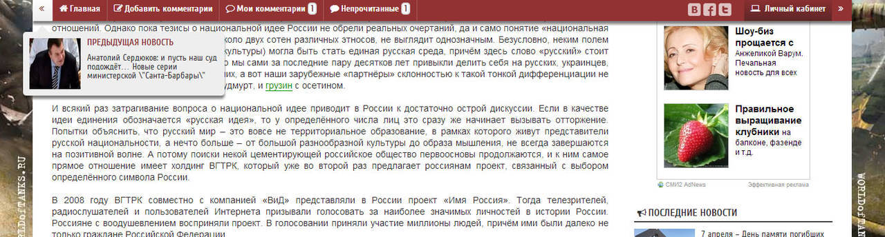
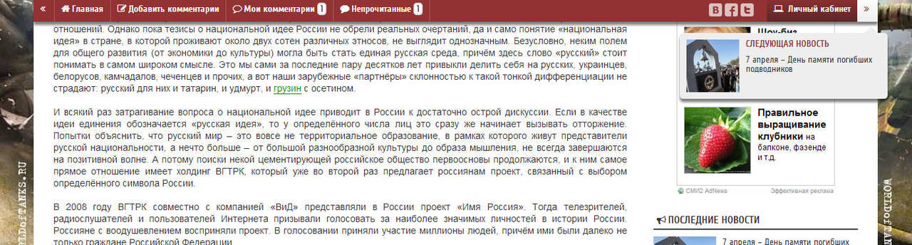
Menu at the top of the page
Appears when scrolling down the page.
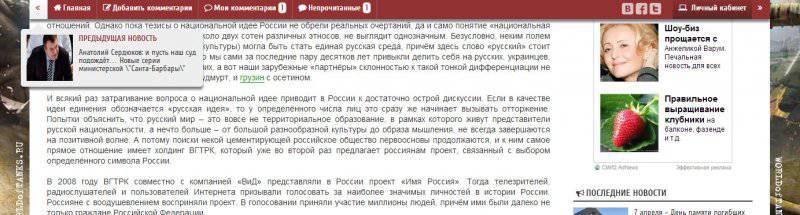
Left and right in the article in the top menu - arrows, when you hover the cursor on them will appear "Previous News" And "Next news". Clicking on them will open the article.
"Home"- the main page of the site will open.
"Add comments"- the page will automatically scroll to the add comment window.
"Unread"- Shows how many unread comments in this article since your last visit to this page. When you click on a digit, the page will scroll to the next unread comment in order.
"My comments"- Shows how many of your comments are in this article. When you click on a digit, the page will scroll to the next in order for your comment.
Add a comment

Added buttons: "Picture"- to insert pictures into the comment (pictures are uploaded to the site),"Insert video"- insert video in comment.
"Born in USSR"

For those wishing to have the opportunity to change the box next to the avatar on the flag of the USSR. To do this, go to "My Account" - "My Profile" - "Edit Profile". Put a tick in front of "Born in the USSR." Click "Edit".
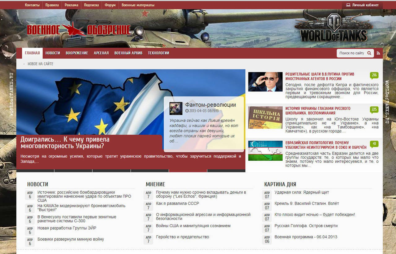
In the rotator on the main page along with popular the news showing a popular comment in this article.
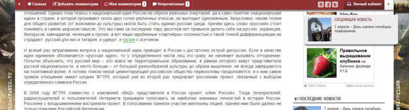
Menu at the top of the page
Appears when scrolling down the page.
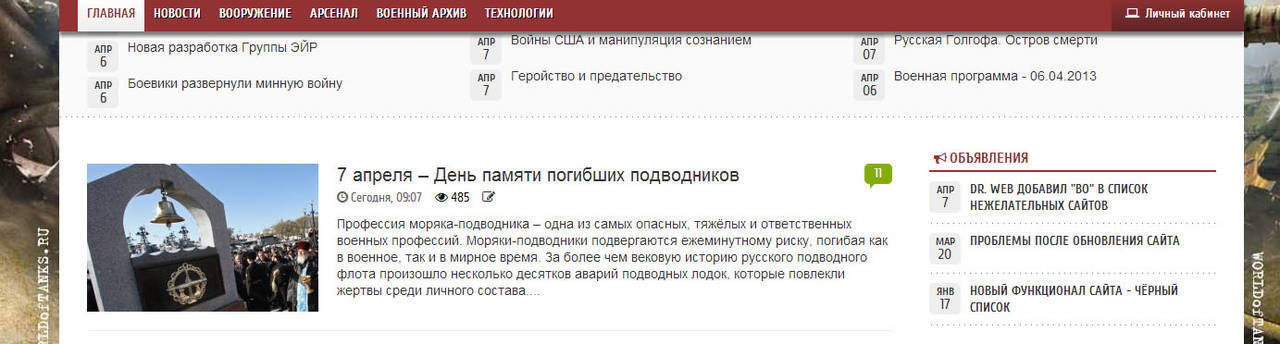
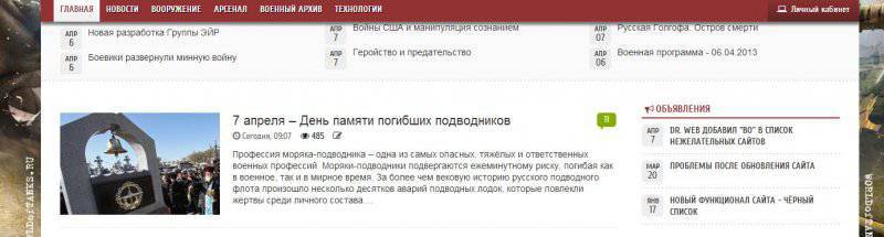
On the main, in categories
Article
Left and right in the article in the top menu - arrows, when you hover the cursor on them will appear "Previous News" And "Next news". Clicking on them will open the article.
"Home"- the main page of the site will open.
"Add comments"- the page will automatically scroll to the add comment window.
"Unread"- Shows how many unread comments in this article since your last visit to this page. When you click on a digit, the page will scroll to the next unread comment in order.
"My comments"- Shows how many of your comments are in this article. When you click on a digit, the page will scroll to the next in order for your comment.
Add a comment
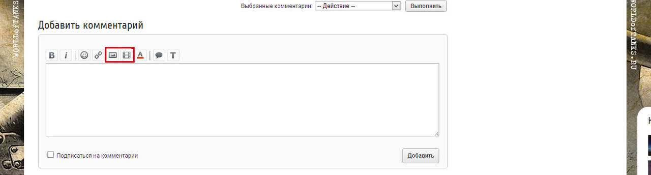
Added buttons: "Picture"- to insert pictures into the comment (pictures are uploaded to the site),"Insert video"- insert video in comment.
"Born in USSR"

For those wishing to have the opportunity to change the box next to the avatar on the flag of the USSR. To do this, go to "My Account" - "My Profile" - "Edit Profile". Put a tick in front of "Born in the USSR." Click "Edit".
Information